My daughter and I were lucky enough to visit the Denver Art Museum over last weekend, and I came away (as I often do) with a number of new favorite works. What I like about visiting a museum is not only getting a more personal feel of the artworks, but I come upon new styles and new pieces all the time.
Now, I’m an illustrator of course, so I’m drawn to other illustrators and illustrative works. It’s no strange thing then that the piece above caught my eye at the museum, as it is by one of the great illustrators of the twentieth century.
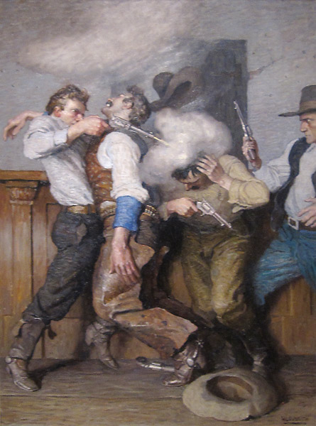
This is N.C. Wyeth’s Gunfight (1916. Oil on canvas, 34″ x 25″), a piece that really caught my eye when we were going through the museum. I’ve seen a number of Wyeth pieces in museums now (including the Benjamin Franklin work at the Amon Carter Museum in Texas), and I always have to stop and look at them.
One thing I’ve read while getting information on Gunfight is that Wyeth’s work here seems staged, as if it’s in a play. That’s not unusual for Wyeth as far as I can tell, I’ve seen quite a number of his works that seem to have that feeling.
For me though, I don’t really consider that a bad thing. I see it more as Wyeth’s composition technique, using the more plain or set background with the complexity in front of it to give the viewer a faster, easier sense of what is happening in the scene. As Wyeth’s works often accompanied a story, it’s a fine balance that the artist has to deal with. The illustration adds depth to the story and gives a better understanding of what’s going on, but it also can’t interfere too much lest the reader stop reading along.
It’s a little harder to tell in my decently fuzzy picture above (I couldn’t find a larger one, though the intent is all there), but Wyeth uses a nice contrast and color palette in the work. The blues and brighter white areas bring your eye right to the action, and add to the overall sense of excitement in the otherwise drab palette of the background.
It’s definitely an action piece, more “pulp” than what would normally be considered fine art. It’s a romanticized, almost staged battle, but that doesn’t throw off the effect at all. It brings you into the fight, into the adventure, and does what a good illustration ought to do. It makes you want to finish the story, and find out what happened once and for all.
Opinions?


