I never just charge into a piece for the sake of doing art, I always let it mull around in my head some first. Sometimes I have a pretty good idea and I just need to smooth things out. Other times, there’s a lot of thought in what the scene portrays, who’s in it, what’s their motivation, did they just do something or are they about to, so on and so on. If you don’t think about the overall work ahead of time, you’ll end up with a mess.
I tend to think of everything in a scene as being it’s own layer. It will have it’s own world to live in, it’s own feel. In turn, it will get other textures and influences from other layers, and in turn influence those other layers. Before too long, everything is interacting with everything else, and you have a scene.
But that’s part of my nature too. When I’m thinking about something, I see it in my head in three dimensions. Something that doing sculpture long ago helped me with was seeing things in my head that way, and now I spin them in all different directions until I find the right image to work with.
I’ve seen quite a few bad covers lately where the artist is obviously only thinking in a flat, boring way. They get some idea for a character, and in their head that character and all of the surroundings live at one level. So when they do the artwork, that’s how they think. Everything ends up flat, with no fading, no differences in contrast or color, and no indication that what’s they’ve created is it’s own world.
I think that’s important as an artist, especially as an illustrator. No matter what your style is, be it a realistic style or something more abstract, you are still pulling the viewer into your world, and they have to buy it. If they see it as a flat piece of art, they won’t be moved to explore your world, and, if it’s the cover, you as the cover artist didn’t do a good job of selling the work.
The cover I just finished (more or less, there are a few tiny tweaks) started out as more of a flat piece. So I started spinning it my head, changing angles and perspectives, and there’s this subtle voice in my head that keeps saying “nope. nope. not that one. nope.” Until it clicks, then I start whittling it down to the real image. Then when I get it set in my head, I ask myself how I can make it better, more dramatic, and more interesting.
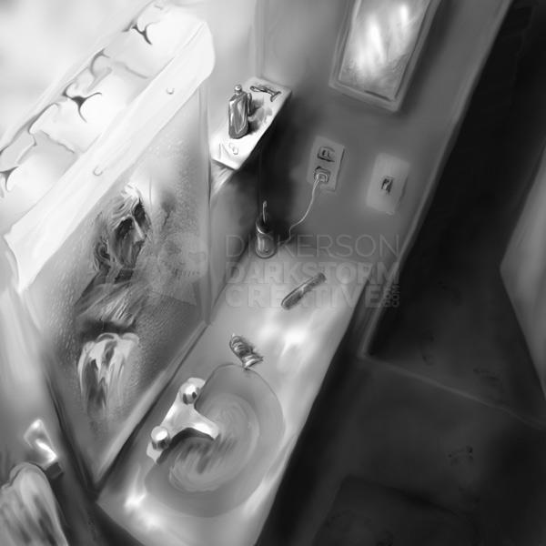
Usually that leads to me picking the absolute hardest thing I can think of doing. Which sometimes frustrates me, but hopefully afterward makes me a better artist. The best example of that is “In the Wrong World” based on a Peter Straub story I did for Cemetery Dance last year:
I spun that around in my head until I thought it would look cool, then I remembered that it’s a really difficult perspective to pull off. Way high, at an angle to everything. On top of that, I completely changed my working style from doing everything in layers and textures to doing everything as a painting. Everything has a stroke, either direct paint or a smudge stroke with a paint brush tip (save for the photo on the wall and the texture on the mirror).
Both changing my style and my working techniques, as well as such a rough perspective, was almost idiotic to try and pull off all at once. But I went for it and, despite a few flaws here and there, I think the emotion of the piece speaks for itself. Several have told me that it’s my best piece (I don’t think I have a “best piece”, only decently done parts of pieces), so I might be on the right track with it.
Overall, I think all artists, in fact nearly every piece on the earth, has some kind of flaw, even if it’s so tiny only they ever know it’s there. The trick with really good art is that those flaws don’t detract from the work itself, and often even enhance it. Artists sometimes just want to create art, but that’s not how I approach it. I want to move someone to some emotion, to ask questions of themselves and of the work, and hopefully give them reason to think about the image for a long time after.


2 Comments
laurastilllives · September 9, 2010 at 11:15 am
very nice work, I enjoyed looking at it, I love the perspective. I really love pieces that convey emotion! sorrow and joy and especially passion.
admin · September 9, 2010 at 8:53 pm
Thanks, I appreciate that! The perspective wasn’t the easiest to try and pull off, but I’m happy with how it turned out. Nothing ventured, nothing gained, as they say.
Comments are closed.