I’ve been very anxious to show everyone this, and now, upon the release of the novella, I can do just that. Below I’ve attached a number of pieces of art that I did for author Brian Keene’s book Scratch, just released from Cemetery Dance Publications.
Scratch, if you don’t follow Keene’s work (and his followers are Legion), is the story of a giant snake. One that gives our characters quite a bad time.
I have to say, working on such an in-depth and extensive project was a daunting idea at first. But working with an author like Brian, who is so open to ideas and so helpful with the ones I came up with, was just fantastic. All the fine folks at Cemetery Dance are very supportive and wonderful to work with as well, and overall this was a great experience.
Now, the art itself is spread quite thoroughly throughout the book, and while the esteemed Mr. Keene doesn’t think that the art alone gives away the story, it’s certainly a possibility.
So, fair warning. The art is chock full of spoilers.
One more time, for those Keene fans (and others) who haven’t read it:
SPOILERS!!!!
If you’d just like to see what the art looks like, please enjoy the full gallery below. Every image in Scratch is there, please let me know what you think.
[nggallery id=6]
If, however, you’d like a bit more “meat” with it, follow along below this (and to the next page) for comments on how I created the art, thoughts on it, and so forth. REALLY spoiled then, and I mean it.
After this, there’s no going back, because the rest below contains
SO MANY SPOILERS!!! NOT KIDDING!!!
Without further ado, follow along to the next page for my insights.
Now, onto the ridiculous spoilers. Also, I suppose, some insight on the art itself (at least some of it). I’m not hitting each piece, just the ones that are interesting for artsy reasons.
Also, it’s long-winded, so best of luck.
1. Working the cover
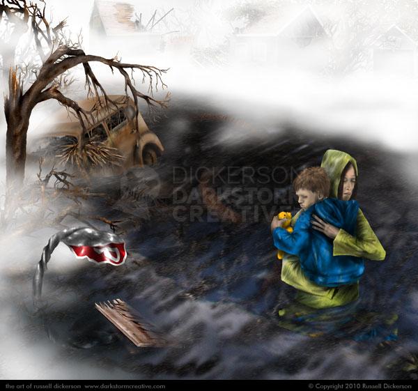
The cover, of course, is meant to sell the book. In this case that was easy, as Keene’s fans are pretty rabid and tend to pick up what they want as soon as they can. So I was able to relax a little more and try to make it interesting.
The cover is a wraparound, so for sales you only ever saw the right half of the image. As I thought about it in the months following, I may have changed the approach a bit. I think the overall wide image is fine, and is cohesive, but as a split it isn’t as interesting as it could have been.
It’s certainly a multi-layered idea, between the wreckage back in the fog and under the water, the reflection of the sky and the characters in the water, and so forth. I think that gives it a certain depth, and helps add to mystery of it.
As far as covers, I certainly could’ve just slapped a giant snake on it and proclaimed my awesomeness, but I value every bit that I do. I want to stay away from the cliches, the obvious angles and such, and try to bring something different to my art.
2. Dogs and such
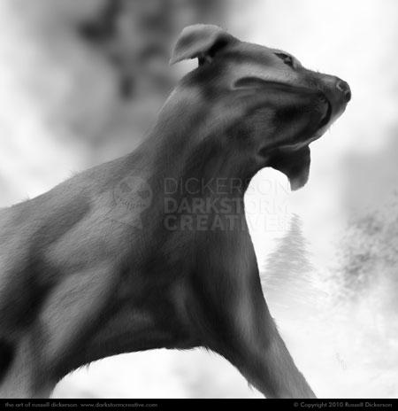
Now, this one isn’t too exciting for you people, but for me it was a huge step in the right direction. Due to the length of the story, I needed to have illustrations throughout, we’re talking every few pages. There’s not always a lot going on in the story at those spots, so I needed to come up with an interesting image each time that happened.
I realize it’s just a dog. I could have easily just painted it watching the water or something. But, as I learn how to do my craft, I’ve come to the conclusion that I don’t just want to settle for something. No matter what kind of image it is, I want to rethink it and make it cool.
Here, I wanted this simple scene to be far more dramatic, and I think with this angle it works. I also don’t get to paint or draw animals too often, and I wanted something cool to do with it. I’m including it because, as an artist, to me it shows that I’m growing into being an artist, and being more comfortable with it.
3. Depth of field
Along with technique comes experimentation, something I did throughout Scratch. Sometimes it works, sometimes not, but it’s always good to try and come up with something a bit more unique. If I just did the first easy thing that came up, I’d be boring, predictable, and a crappy artist.
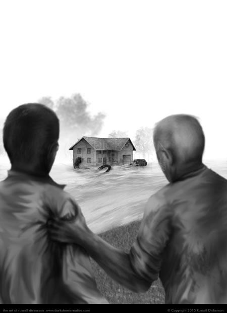
My original thought here was to show the snake from inside the house, the attack as it happens. But Keene wrote the story from the perspective of these two characters. They don’t really know what they are getting into, so I wanted the audience to stick with Keene’s prose and not really see it either.
By playing with the blurriness of the closer characters and the sharpness in the distance, which photographers call “depth of field”, we’re able to show what happens and still maintain distance from it. The slight blur of the two men draws the eye the sharper parts of the image, in this case in the distance.
Scratch busting into the house is the whole point, but we’re not ready to see it just yet up close. It would kill any of the tension in the story to see it right now, and as an artist I can’t do that to the author or the reader. Hopefully though it at least piques the reader’s interest. Hopefully they reach this point and think, “HOLY SHIT THAT SNAKE IS HUGE! WTF IS IT DOING?”
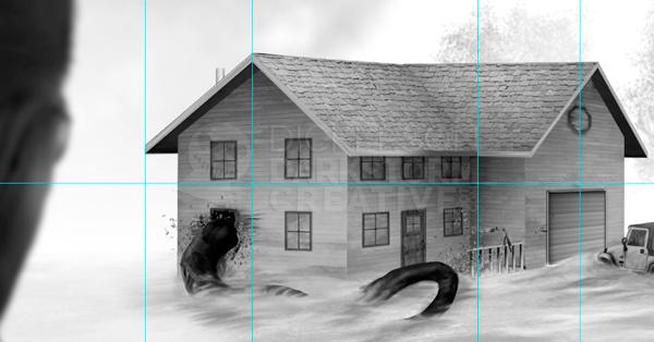
As I am crazy in the head (or maybe I started out with a different idea), here’s what the house actually looks like in Photoshop. It’s not perfect, but being so far in the distance I made it close and went with it:
As a side note, it’s also a reminder to me to read the prose when I have it right there in front of me. That jeep, mentioned 145 times on that page (that’s a guesstimate), is something I forgot to add until I nearly sent it off as a final. Oops. Lesson here kids, pay attention to what’s written if you’re supposed to emulate it.
4. Subtlety in pictures
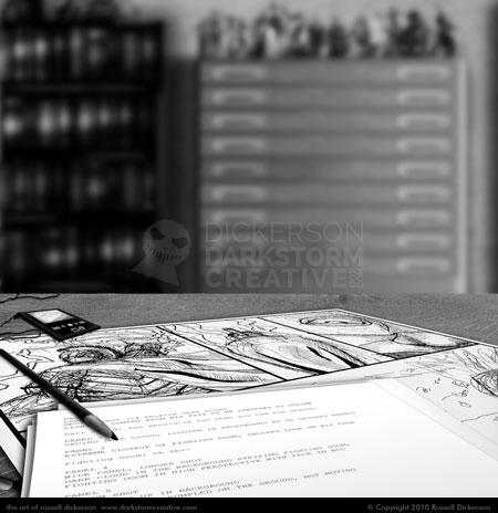
Ok, this image appears near the beginning of Scratch, highlighting what the main character, a comic book artist, is working on:
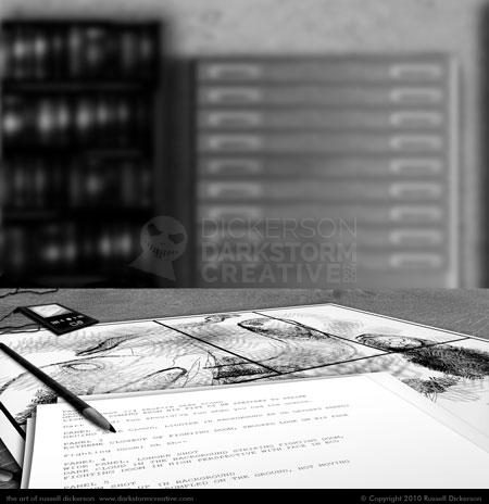
Here’s the image near the end, of what our main character is working on after the events of the book have unfolded:
It’s subtle, especially if you’re actually reading the book, but it’s there. Aside from the missing toys way back on the shelf, the art he’s working on is different too.
Another experiment, and I don’t know if it worked or not. The idea was that the main character has been so horrified and so traumatized by the events in the book that he can’t get over them. Instead of the comic characters from the first image, all he can think about is the snake and the little girl (we’ll get to her in a moment).
I kind of doubt most people are going to catch the difference, but as an artist I wanted to add something else to the book. It’s almost like a quiet gift, a thank you for coming this far with us. It’s also an experiment in creating similar art from a similar scene, something (below) that I tried with the endpapers.
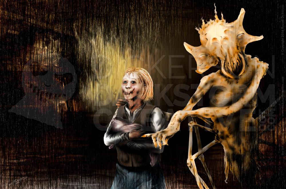
5. Little girls and giant snakes
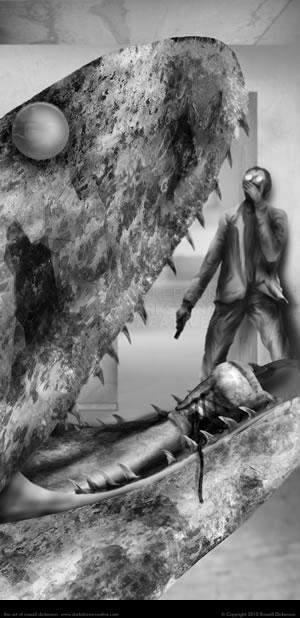
My good friend and fellow artist Kirk Alberts, though liking this one below, said it was also, “nasty”. That’s just like it feels in the story here too.
I don’t get to paint the climax of the story too often, usually that would be giving things away and I don’t want to do that. So I reveled in the chance to paint this one.
It’s also an exercise in not just doing the easy thing, or the first thing that came into my head. In this scene, the two characters run into the room, just in time to see Scratch devour the rest of the family. They witness the little girl’s legs going down it’s throat, a nasty enough scene.
My first thought was to show it from the character’s perspective, jumping into the room only to see the snake rearing up. It would’ve worked I think, but it lacked the POP! that I like to see in art. I could’ve even made it far more gruesome that way, but I’m a firm believer that things are scarier when your brain fills the scene in with what it can’t see.
So I turned the perspective 180 degrees, so that we see the character’s reaction literally through the horror. Not only is it shocking (and I’ll post the duotone version that’s even more so), but I think it’s also more genuine to the rest of the art and the story. We’ve been following this character the whole time, we should be concentrating on him and the horror he feels at this climactic point. It would be disingenuous to suddenly highlight the monster of the story when it’s the character we’re supposed to feel about.
6. Endpapers and Civil Wars
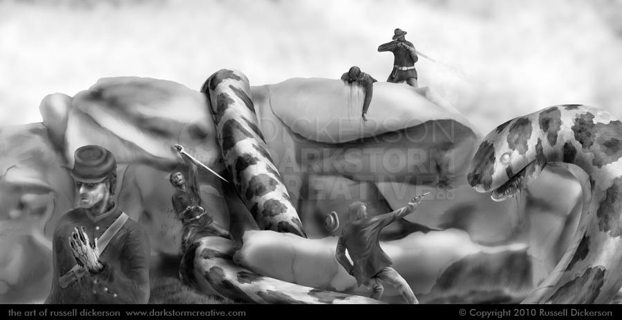
For those who don’t know, the endpapers in a book are the papers that are inside the covers. They are often blank, but in some cases there’s art on them. Cemetery Dance also commissioned art for those, one for each of the two versions of the book, and I wanted to give them something unique.
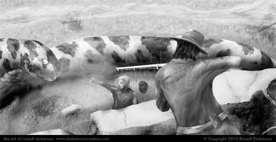
In the course of the story, there’s a discussion about the legend of the giant snake. In the gallery above there is art of a petroglyph found by a river, for example. What I latched onto was the mention of a rumored Civil War battle between soldiers and Scratch, something that really stuck in my head.
Brian also thought that might be interesting, and after CD agreed we went ahead with it. On top the idea that the endpapers be this Civil War battle, I also thought it would be neat if the two images were of the same battle from different angles. Mostly because I couldn’t come up with anything harder to do at the time.
With lots of measuring, sketching, remeasuring, resketching, painting, moving things in Photoshop, moving them each another 784 times, I think I ended up in at least the ballpark of similar.
End: Wrapping it up
So those are the highlights of the art, and as always let me know what you think of them. Opinions?
3 Comments
Craig Clarke · August 5, 2010 at 10:14 am
Fantastic work! I agree about the angle of the dog. It’s a terrific perspective and actually helps get the idea across.
brownie · August 5, 2010 at 5:05 pm
I think the art looks FANTASTIC. I’m a huge fan of creature-features, so looking at these pieces, I’m practically drooling!
Nice work!
admin · August 5, 2010 at 6:50 pm
Thanks all, I appreciate that!
Comments are closed.