Now, before we begin, let’s just say that my years of being an engineering student are way, WAY behind me.
But I was looking at a couple of sites today that discussed the Golden Ratio or the Fibonacci Spiral, a quasi-magical scientific idea (let that roll around in your head for a minute) by which supposedly “better” or “more pleasing” art can be developed. The spiral is better defined on other sites, so I’ll wait patiently while you Google it.
… all done?
Now, I don’t discount such ideas, including the rule of thirds, the rule of not centering your work, those kinds of things. I think they have their place, and if anything over time the artist learns them subconsciously anyway. But after looking at a few examples, I thought, since I’d never done it with my own art, what my work might look like with the Golden Ratio applied.
This is by no means scientific, and is probably flat out wrong in implementation. But I thought the results were interesting, and I’m bringing them here to you fine folks (or is it “folk”, are you the only one left?) to see what I came up with.
Since I could creatively crop any of my pieces to fit the right square proportions, I didn’t think that was fair. Since many of my works have to fit specific, defined print sizes, the cropping would be, I think, cheating. So I decided that mathematically it should be the same ratios on a piece regardless of final proportions, and “squishing” them to fit the rectangle would be more honest.
Let’s face it, I’m an artist, not a math whiz. So if you don’t like it, go read about the Riemann Hypothesis, you don’t need an art site anyway.
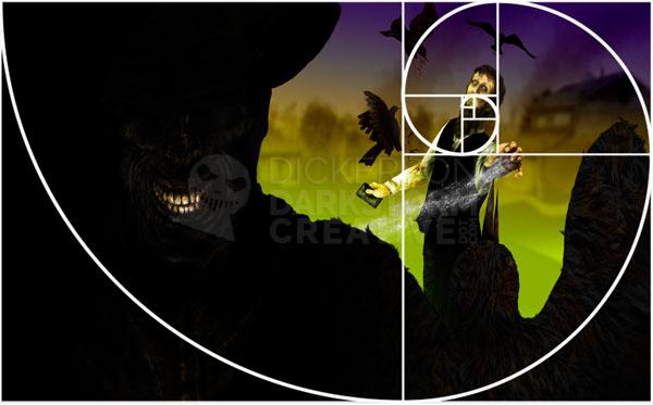
Here’s the first one, my recent (squished!) cover of Brian Keene’s book A Gathering of Crows:
Levi is dead shot on the spiral.
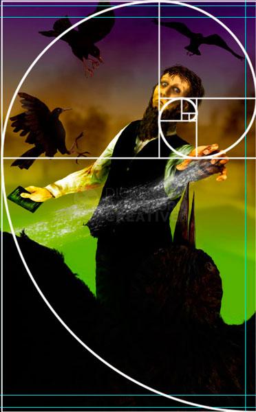
Also, his hand is right at one of the cross marks, and the birds somewhat follow a curved path. Interesting. Then, just for giggles, I set the rectangle to only show what will print on the very front cover (it’s a wraparound), which proportionally is about the same as the rectangle (not squished!):
Which is even more interesting. Even turning the spiral, Levi’s hand is still at a cross. The tips of the crows’ wings nearly all meet on the spiral line. The flow of the piece, where the dark and light areas run, seems to follow the line fairly well.
Huh.
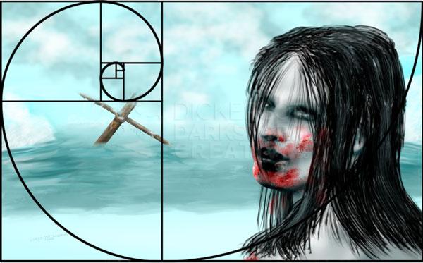
I most certainly didn’t plan it, and I don’t really know what it means. But let’s take a look at another piece, my work A Violent Reaction (squished!):
Now, this piece was less planned than the Crows cover, as it was more of a catharsis piece that just needed out of my head. So, that it’s only close to the line, not right on it, would probably be expected. But the mast isn’t far off center, and the angle of her jaw corresponds pretty decently with the spiral line.
Very interesting.
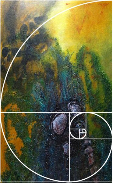
I decided that, since I do so much digital work, maybe I should look at how it works out with my far looser acrylic paintings. Here’s Apotheosis of War (squished!):
That one I can’t explain.
See, on this piece I changed my mind plenty of times, until I thought that it was “right”. No measurements, no sketches, just slap paint at the canvas and hope for the best. But the center of the mask is right on the spiral, as are the skulls and even the bright highlight in the yellow. The rough, blue-green texture even more or less ends within the border of the spiral.
Again, huh.
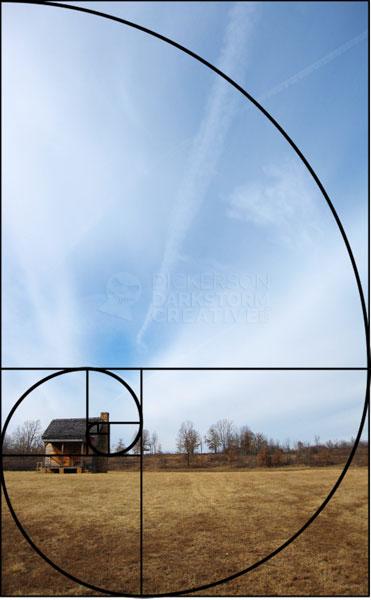
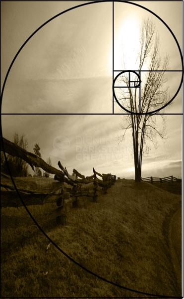
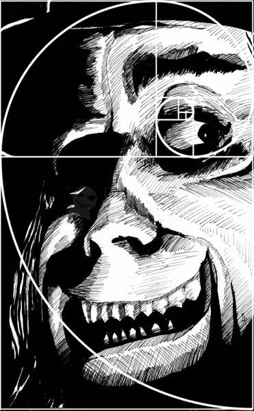
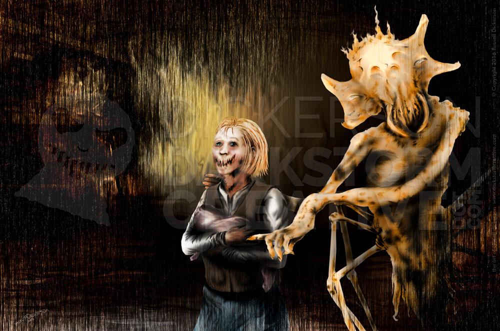
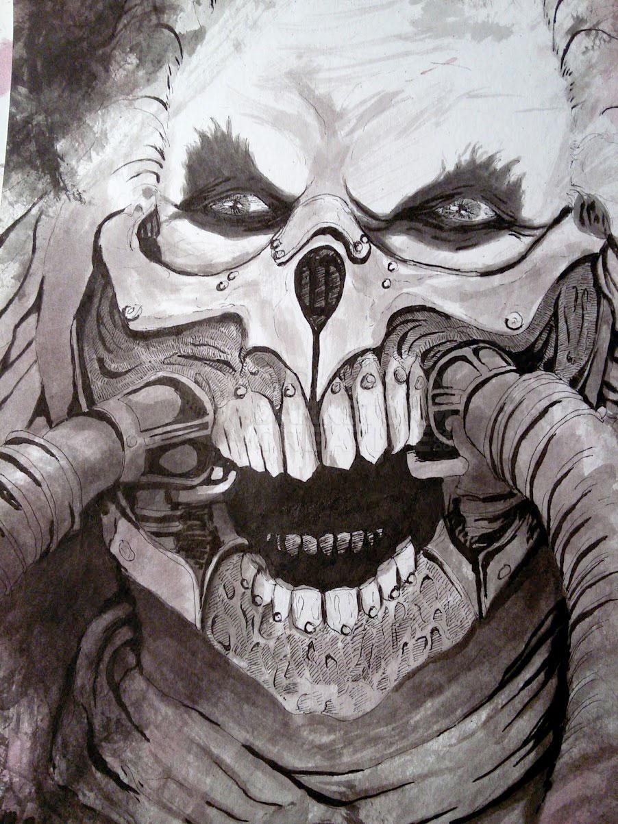
Here are a few more (squished!), an ink and a couple of photos that I’ve taken. While I don’t think any of my works are right on the money, it’s very interesting to see that some of them aren’t far off at all. I’m not honestly sure what that means, but I do think it’s fascinating.
Opinions?
6 Comments
Glendon Mellow · December 22, 2010 at 6:20 am
That’s fascinating and amazing, Russell!
admin · December 22, 2010 at 7:13 am
I definitely thought it was fascinating, I sort of assumed going in they wouldn’t even be close. I would imagine if I looked at all of my pieces I’d find plenty that don’t match, but it was fun to try. Thanks!
Brian George · December 22, 2010 at 10:17 am
What an interesting post. I have long been interested in how geometry and balance play into composition. I had a fantastic art teacher in high school who taught us composition. He had a background in fine art and old school graphic design (he often spoke of paste ups and mechanicals, just as computers were taking over). His approach to teaching us composition (generally) was to have us use reading direction (in English, left to right, top to bottom) to lead the viewer through the composition. So generally all of us students had compositions that were similar to your ‘Apotheosis of War’, with the focal point on the lower right (where, if reading a page of text, your eye would come to rest). Of course over time, we were ‘allowed’ to break this ‘rule’. But it was an interesting way to learn the basics of composition.
As to why it may be more ‘pleasing’ to compose images this way, who knows? Visual balance? Having large expanses of space with a concentrated focal point in a smaller area has always felt balanced to me. I do it in my own artwork. Your image of the barn with the big sky is a great example of this type of balance.
I’ve been meaning to look it up, but I remember a doc. hosted by John Cleese and Elizabeth Hurley (?!) on ideas of beauty that used geometry as a scientific basis for examination. I don’t remember how good the science was, but I remember being intrigued.
admin · December 22, 2010 at 10:40 am
Thanks for checking it out! I do think that over time you learn where things might look more pleasing or more interesting. That certainly part of an artist’s style too, I’ll bet there are plenty of artists who are consistently never close to the spiral, which is in and of itself a pattern. I seem to remember something with Cleese and Hurley, I’m going to have to look into that.
Thomas A. Erb · December 23, 2010 at 11:46 am
Wow, being an artist myself (and hating math) I am amazed how these things actually do work! You said it best when you mentioned we learn it subconsciously. I think artists’ brains just click that way.
Very cool stuff Russell.
-TAE
admin · December 23, 2010 at 6:37 pm
Thanks! I might try it on a few other pieces if I have time. I would imagine that, simply due to print sizes and such, that I can’t always hit it close.
Comments are closed.