This is sort of an old story, since the three Maelstrom books, two by Brian Keene and one by Kelli Owen, have been out for a few months now. But, as with many things, life managed to get in the way of posting the art that I did for the run.
I decided to post them all again, save for the two I already posted (here and here, go check them out). I’m happy with them, though with all things there are parts I would change now. But, that’s the way of the artist. I’ll also explain a bit on each one, since, as both of you who read my blogs know, I like to babble on and on.
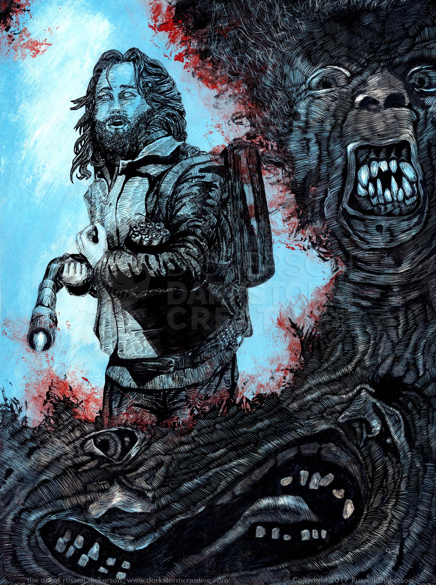
Let’s start with my cover art for Brian Keene’s book The Rising: Deliverance. If you haven’t read Keene’s classic book The Rising, well, go out and get it (here!), I’ll wait. It has the best ending ever, believe me.
The Rising: Deliverance takes place within the first book, an aside for one of the characters. Now, I won’t give anything away on any of these stories, but let’s just say The Rising is a bleak tale, and the publisher (Maelstrom is an imprint of Thunderstorm Books, edited by Paul Goblirsch) and we wanted to tie the three books together visually.
If you have seen the other two Maelstrom covers (or followed the two links to them above), you can see where we went with them. The cover for Six Days is very dark, as is the story. The cover for A Gathering of Crows is half and half, light and dark, again much like the story itself.
With The Rising: Deliverance cover, we wanted to bring light to it, as much because it’s a true sense of the story as it is that it’s not normally done. Many zombie and horror covers are very dark, and in this case the true sense of the story is that there is still some light in the world.
We went with a very bright color palette, and kept the duality of the Crows cover with two characters. But differently from Crows, the character on the right is placed much higher than the left, and subtle sense of superiority, even in that character’s doubt. Where the Crows cover shows the two sides being equally (or nearly so) matched, the Rising cover gives a different feeling. (Note: click here or on the image itself for larger version)
The character on the right fights with his conscience and his beliefs throughout the story, and throughout the original book. I wanted to capture that doubt, of his being torn between the world that once was and what it is now. Whether I did or not I leave to you.
With these three books, I also did art for signature sheets for each one. These are usually done separately, then inserted into the book in the binding phase of production.
The advantage of signature sheets is that I tend to get a lot more leeway with them. Since they aren’t selling the book, like the cover, I can try different things and even be a bit more aggressive with them.
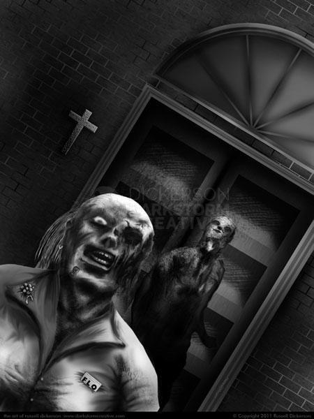
Since we’ve been talking about The Rising: Deliverance cover, let’s just start with that sig sheet. I wanted to bring something different to this one, a different perspective than just another character shot. In the story, the characters are holed up in a church, and I thought that seeing what was keeping them there might be cool.
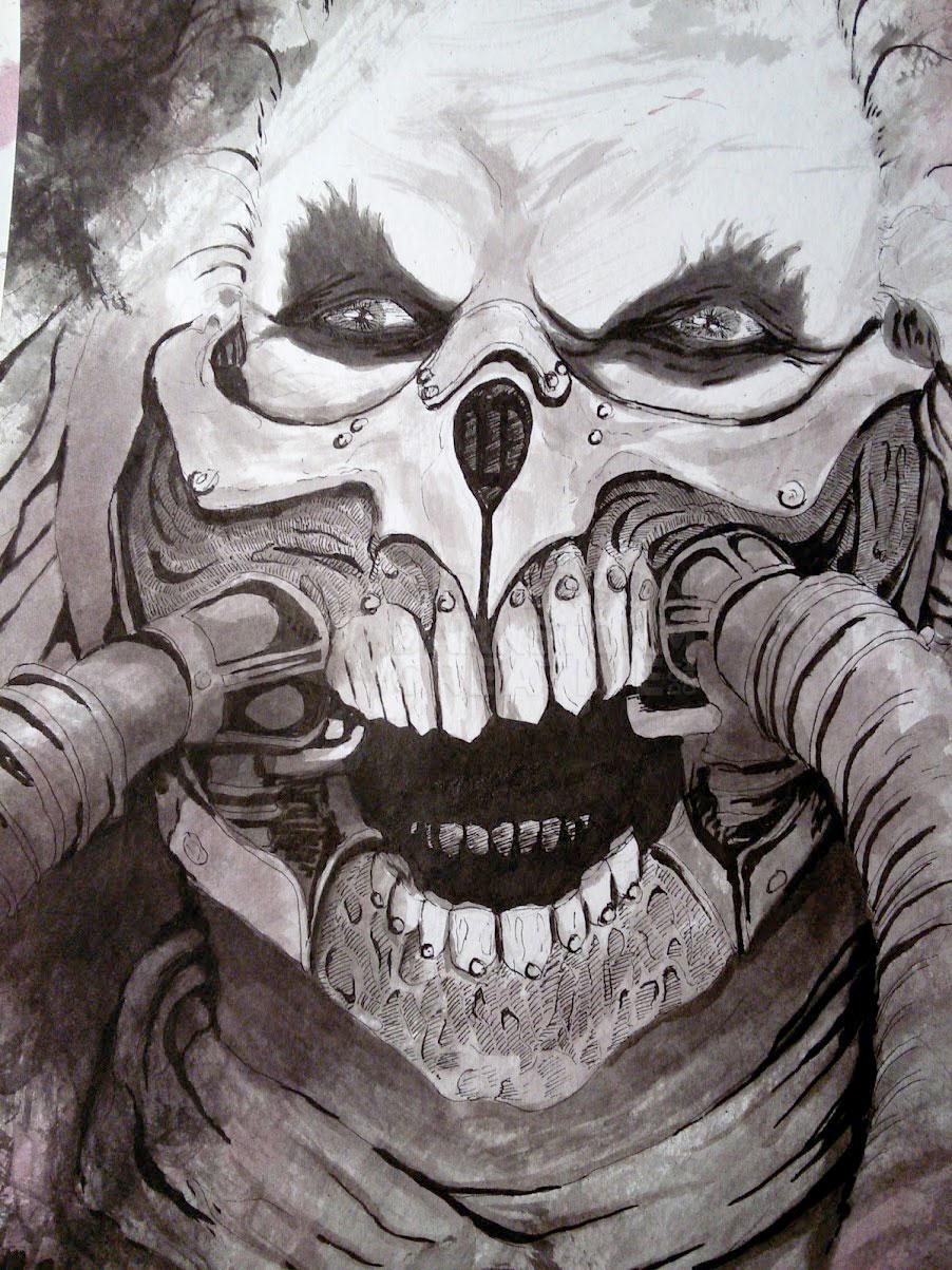
The zombies are heard banging on the door, trying to get in. They are even heard cursing about not being able to, and I wanted to capture not only the horror of these creatures but the superiority with which they act as well. Having them lit by a strong light source let me toy with more high contrast art as well, something I’d been working with on the ink cards.
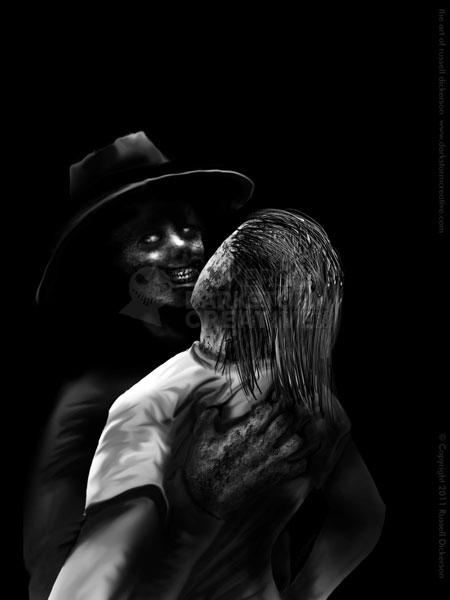
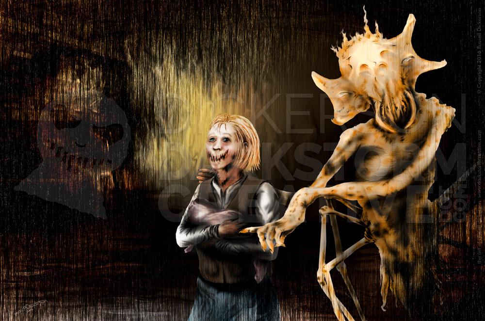
With Keene’s other book in the set, A Gathering of Crows, I still felt that the strong light source would be fun to do. In this case, I wanted to bring up the violent, evil characters from the story, but somehow keep it personal as well. In the story, this is a scene between just one of the evil creatures and an unfortunate woman, but I approached it almost as a dance. A violent one for sure, but still there is a certain personal connection with the two characters that I wanted to capture.
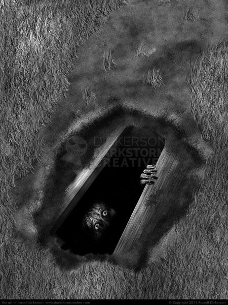
Last, but most certainly not least, is the signature sheet for Kelli Owen’s Six Days. Paul, the publisher, and I had originally thought of doing this idea as the cover, but liked how the other idea was working out instead. Sometimes that’s not how it goes, the artist likes one thing and the publisher another, but in this case I fully agree.
I think the art works, but it’s not as strong an idea as I originally thought of. As a cover it might not have worked as well, and I’m happy with the one we ended up with. I think this one is more about the mystery of it, while the cover we ended up with gives much more of a sense of horror.

