Something that comes up from time to time is the need, as an artist and a designer, to have a portfolio to show someone in person. That could be at a convention, or a job interview, various places where having a portable way to show your work would come in handy.
For many years, I’ve used a simple, letter-sized portfolio, which has worked well. I can have a design on every page, or a group of art pieces, or even change them out as needed. But, for that to really be effective, you need to print new things all the time, and in general over time they tend to get a bit beaten up. You also are limited to only a handful of pages, so you’re forced to choose just a few pieces to try and explain what you do.
Enter the iPad (or whatever your tablet might be, even a smartphone).
I originally picked up the iPad when my laptop died. After a couple of months of discussion, we decided that, for what we do with the portable computer, that the iPad would be fine. It has, in fact, worked quite well, especially as a portfolio.
Now, I’m not going to go into the fanciness of the beast, talking about every little tech thing it can do. This article is more about my experience using the iPad as a portfolio, and some things I’ve learned.
So, here are a few things to keep in mind when you’re using the iPad as a portfolio, in no particular order.
The background
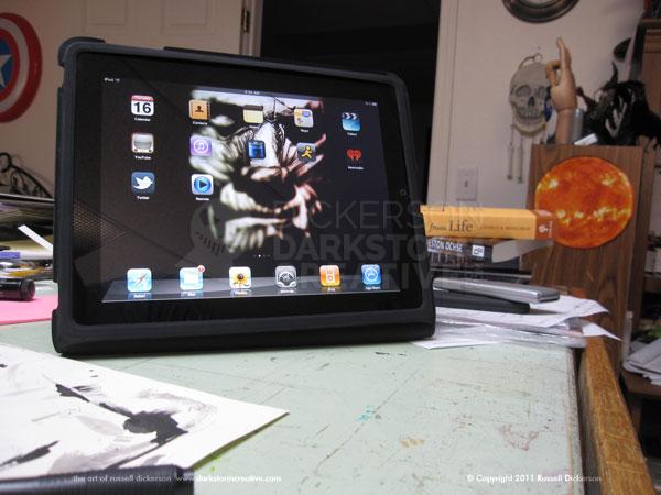
The background image on the iPad instantly tells someone what you are about, or at least strongly hints about the things you like. It, in and of itself, is also a bit of a showcase, so there’s no reason not to have one of your own works as the background. Here’s mine:
Im-Ho-Tep is an ink work that I did some time ago, and is normally a good conversation piece before I ever even open the art albums. It’s a known quantity especially, being a fairly famous film and image, and anything that starts a good conversation is wonderful
The opposite is also true, if you have a great big photo of a naked sex orgy as your background, you might not even get to open your albums before you are dismissed. Which leads us to the next section.
Don’t have inappropriate items showing
Not just for the background, but think about your icons too. If you have an app titled “The Greatest Sex Positions Ever!” with a little sex icon, you might want to put that in a folder.
Also, I’m sure this has happened too (though not to me):
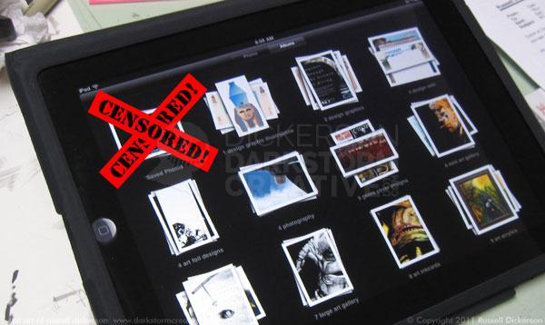
Imagine if you’d just innocently copied/saved an image of a nude woman (for art reference… yeah, that’s it). Well, if you’re familiar with the iPad, images that you save or copy from the web (or elsewhere) are saved in the main album area under “Saved Photos”.
That means that whatever the last thing you copied was, it now shows up there. If it was something that someone could be offended by, no matter how small (giggle), then you really should remember to delete it off of there. Otherwise, let the awkwardness commence.
Cleanliness is next to godliness
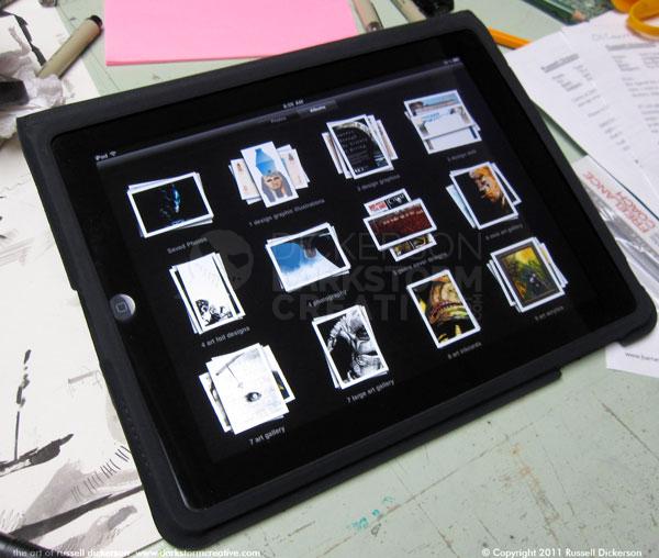
So, you get the interview, or you’re at a con and ready to show your portfolio to the bigwigs, and then you hand them this:
They say first impressions are everything, so your first impression is that you’re a piggish slob who handles everything dirty (don’t take that the wrong way). I mean really, you are hoping for either a job or to do art for this person, and you’re handing them a disgusting mess. I’d walk away if I was that person.
So, before you even get into the situation, make sure that the iPad is nice and clean. Not just the screen, because the case gets dirty too (believe it or not). Wipe the screen down, dust off any bunnies, and hand them what you would prefer to get from someone.
Don’t just stop there either. When I’m at a con with the iPad, I carry a small screen wipe cloth with me all the time. They don’t exactly take up a bunch of space, and it’s easy enough to wipe those inevitable fingerprints off. I wouldn’t wipe it in front of the potential client (“Ewww… you have cooties!”), but maybe on the walk to the next panel you could clean it off real quick.
Organization is the key
Sure, you have a bajillion gigabytes of storage, and so you could in theory put all 3,000 pieces of your art into the main album. But there’s something I’ve noticed when you’re showing your portfolio around, and that’s that some people like a lot of images, some only like a few.
So, aside from saving your images with at least 900 pixels on the largest side, organize your work. There is an enormous amount of space to store images on the iPad, and, as long as you do the 900 pixels thing and save them at 72 dpi, you should be able to get much of your work on one.
To be fair, I do have one album that has around 100 images in it. That album is designed to play as a running slide show while I’m at gigs, and works well for that.
Everything else is separated into various albums. I have apparel designs in one, ink art in another, and so on. But the most important two that I have are the main art galleries. Both are limited to a small number of images. The first has just 15 in it, the second around 30.
Why only a few (despite my having hundreds of art pieces)? It comes down simply to boredom. People tire sometimes of looking at your work, or feel obligated that, since you handed it to them, they have to look. That puts everyone off, and it’s not where you want to be.
Sure, the iPad works great to zoom in on art, check out the work thoroughly, and so on. But if you’re forcing someone to look through ALL of your images, they will make sure to forget you later on. So, you hand them the small gallery first. If they like that one, you can tell them you have a few more in the slightly larger gallery, or even segue into one of the specific galleries if something had captured their attention (say, show them the ink gallery if they liked one ink piece).
Work with them, people, don’t try to kill them.
A great and wonderful thing
Overall, it’s wonderful to use the iPad as a portfolio. Instead of printing out things you may not need, and having to often deal with color issues, it’s already there.
It’s a presentation for you as much as for the iPad too. After you ask them politely if they’d like to see your work, don’t prattle on and on about the technology. Let them ask about it, otherwise if you go on and on about how cool the iPad is you’ll sound snobby.
When you hand it too them too, hand it to them with the correct album already open on the first image. I usually just slide it back and forth once, so they get the gist of how to move to the next image. I do that in a subtle way too, just so they notice but aren’t put off that you think they are a dunderhead.
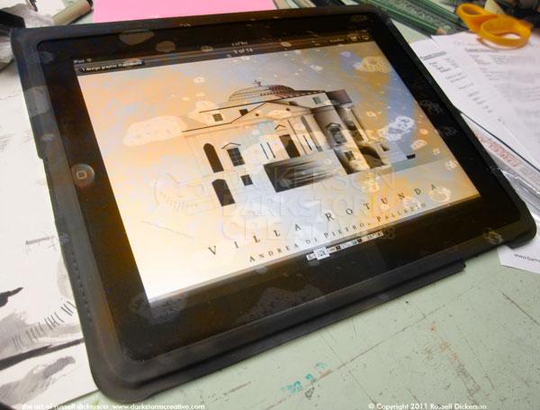
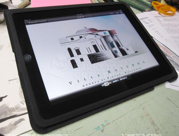
If you can (I won’t go into the tricks of it here), organize the photos themselves so your favorite one is first. Here’s how my graphic design illustrations gallery starts:
When I handed them that, not only did they see my work, but it opened up a nice conversation about Palladio, illustrations, and design. I can’t ask for more than that.
