Recently, I’ve had a couple of commissions to do ebook covers. Which is great, because I really am a starving artist (unemployed and all), so commissions help me survive. But that’s only part of why we’re here, the other side of it (and the point of this article) is designing for ebook covers.
Now, at the end of the day, the design really isn’t radically different. You still have margins, it still has to be proportionate, and so on. But there are some things to keep in mind with the ebook cover design that are very important, both with the artwork and with the design of the cover.
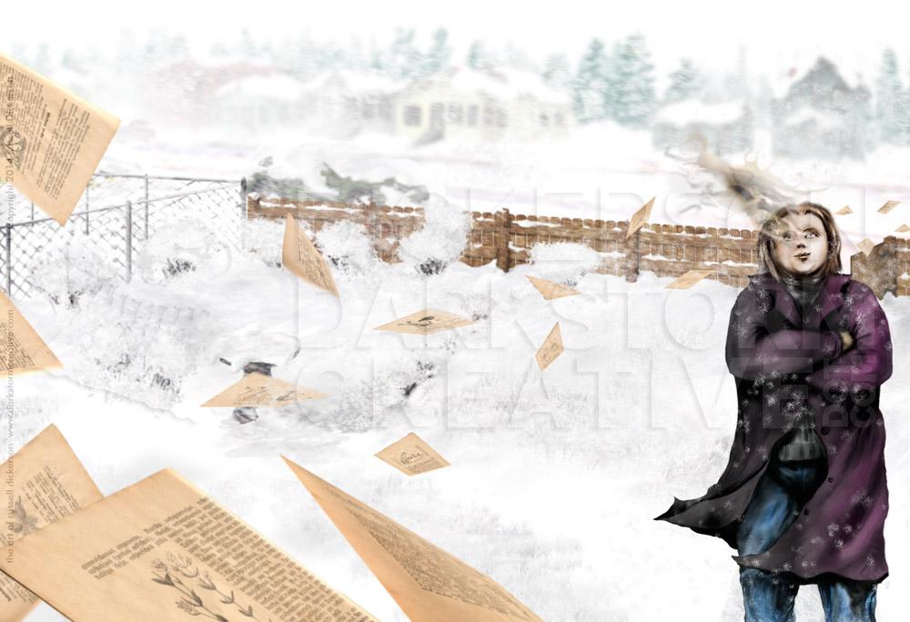
Let’s talk about one of those new ebooks, that it now available to purchase (I’ll revisit the other when it’s up for sale). The book is Knock Knock, by S.P. Miskowski (go pick it up online here), and features one of my pieces of art on the cover. The piece is Eternity in the Old North Hall (see it here), and it was chosen partly because the author simply likes that piece and it fits the story, but also because of my rough July schedule. That meant I didn’t have time to get a commission for a brand new piece (but I can now, it was all timing), but luckily one of my unpublished works turned out.
I did, however, have time to add some cover text to it for the ebook, and that’s where our discussion begins. As with many design projects, I asked some questions about what the author liked, what the text needed to be on the cover, which services the ebook would need to be posted on, and so on.
In creating the design for the ebook, several things became quickly apparent. First, each ebook service wants a slightly different size to work with. Most of them are in the general ballpark for proportions, but each wants its own deal (and often even different sizes for the same ebook). The art works fine, as I, by my nature, tend to remember margins even when the art isn’t for a certain cover.
But that means when the design is coming along, it pays to check out a few of the services and see what each wants. In most cases, the general margins I had worked fine. But in a couple of cases, the design would have been cropped to be a bit shorter, albeit not much. So I just brought the top and bottom margins in a little more, and overall that wouldn’t affect the other sizes either.
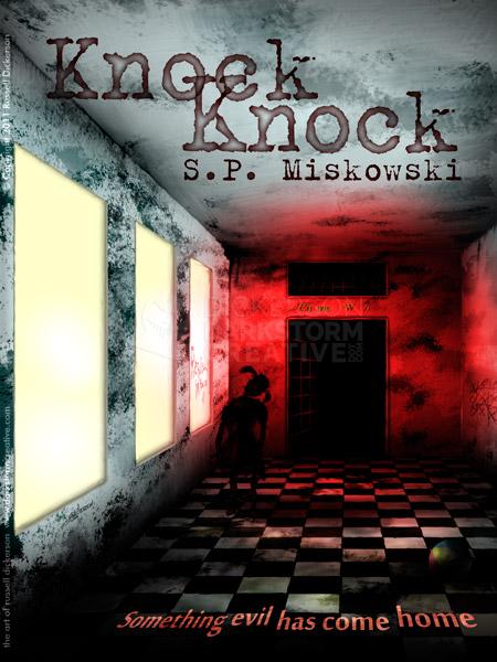
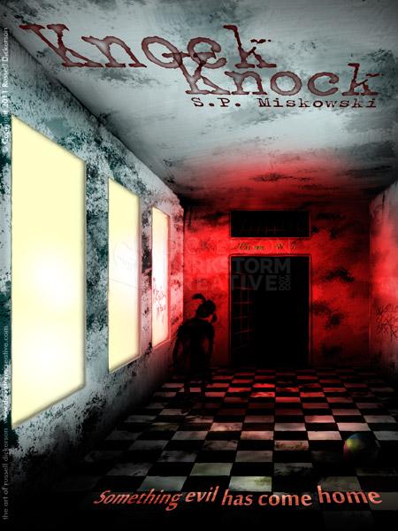
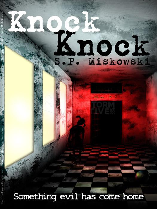
Unless I just have “Brilliant Idea #1!!!”, I tend to give my clients 2-3 basic layout ideas to consider. That way if they like one better, or if something might work better for reasons that they understand in their own industries better than I do, we’re fine. They don’t usually stray too far from a main idea, as the three options below show you. But this is the time to toy around a bit, and try some different ideas and effects:
Now, it’s apparent that the bottom tagline works best on the last one. It’s the clearest, and stands out best against the dark floor. The others might be fun and interesting, but at the end of the day don’t really add anything. At least not enough to be worth the effect.
In the first two, the title has a great effect that really works with the art itself. It’s kind of an “old dried blood” feel, and I really like it quite a lot. But the problem is that the coolness of it doesn’t outweigh the major problem of using it.
Think of it this way. The art looks great like it is (he says, sheepishly), and any of the text designs work fine for a larger cover. But for one, shoppers in the big online catalogs don’t see what you see above. They see this:
The color stands out fine, and in fact might bring in some eyes. Composition isn’t problem, but you can see that the first two, with the neat text effects, hardly work at all. That third one still pops, and even at tiny size you can tell what the title is. You probably aren’t going to see the author’s name most of the time anyway, but as long as the title is obvious it should be fine.
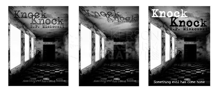
Many of the devices are also grayscale (black and white for you photo people), so that cool art for your ebook looks like this now:
Or, if you’re on a grayscale device looking at cover art in the catalog, you’d get this:
It’s apparent which one is going to work best, and it’s something to keep in mind with ebooks. Again, the design ideas are similar, you’re still trying to sell the book with art and design. But you’re not getting to sell them in a bookstore, where someone can pick up the full-size book and check out the art. The average ebook shopper will be browsing a massive catalog of thousands of ebooks, and a muddied cover might just get skipped.
At the end of things, the author liked the one that actually worked best online, and it gave me an opportunity not only to have a good, easy time working with a new author, but the experience of producing for digital as well. The lessons learned are already paying off, and I hope to learn more with new projects.
Here’s the final cover, a little bit larger. Don’t forget to buy the book too, it’s on sale for a great price here.


3 Comments
New Cover Art: Astoria - Darkstorm Creative: The Works of Russell Dickerson · June 26, 2014 at 1:48 pm
[…] Here’s what it looks like with the title and author’s name on it, which I also created. We had discussed some other layout and font options, but in the end we decided for continuity of the series that it should have the same font as Delphine Dodd and Knock Knock. […]
New Cover Art and Design: Delphine Dodd - Darkstorm Creative: The Works of Russell Dickerson · June 26, 2014 at 1:48 pm
[…] really wanted to have me work on the covers for three of her books, since she had used my piece Knock Knock for her previous cover. Her publisher, Kate Jonez of Omnium Gatherum, agreed, and they made a […]
My cover art for S.P. Miskowski's "In The Light" - Darkstorm Creative: The Works of Russell Dickerson · August 18, 2014 at 10:15 am
[…] despite the feel of each book being slightly different than the others. It started with the cover for the first book in the series, Knock Knock. The cover art for Knock Knock is called Eternity in the Old North Hall, and wasn’t […]
Comments are closed.