Whenever I’m on Twitter (and, to a lesser extent, Facebook and Google +), there always seems to be these great discussions about the type of materials and tools that artists use in their art. Often there are similarities, and quite often too there are new and cool things that I hadn’t heard of before.
I thought it would be a good idea to share what I use to create art, at least traditional art. My digital art is easy enough to explain, it’s Photoshop and a Wacom tablet. But with traditional media, there are so many different combinations and so many different things to try that it’s great to experiment with them all.
So here we go, on to the materials. I took some photos, that way if you’re in the art store the visual of one of the materials might jog your memory. If anything, now I can carry around a couple of pics so that I remember what to buy.
Paper and such
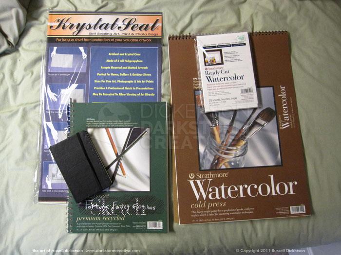
The paper I use (often called “stock” by artists) is fairly consistent, I don’t stray too much normally:
We’ll come back to “Krystal Seal” in “part 2”.
For ink work, I use the two on the right. They are both Strathmore Watercolor stock, 140 lb. Cold Press. The larger one is 400 series, the smaller, pre-cut package is 500 series. I’ve only done one ink on the new smaller ones (Cthulhucraft), but the differences so far between 400 and 500 weren’t much. Still, more experimentation is needed before I can really call that one.
I use the cold press for a few reasons. One, I tend to use a lot of ink, both with large dark areas and with ink washes, and the cold press has no trouble dealing with that. I rarely get warping or the texture of the stock pulling up as I ink, something I’ve had trouble with using other types of paper.
The only thing that I run into is with scanning in the cold press into Photoshop. The scanner will pick up that great texture of the stock, and you have to spend a little more time editing it than you would a Bristol or hot press illustration board. But the trade off for me is just in working with the stock while I’m inking, and I’ve used Photoshop for so many years that it’s second nature now to quickly fix anything.
The two on the lower left are my sketchpads. The smaller black one is a Moleskine, with the storyboard marks inside. Those storyboard areas are great for me when I’m doing layouts and plans for things like comics, but light enough that they don’t interfere when I just want to sketch something. I tend to only use the Moleskine away from home, and I’ve noticed since I’ve been home (unemployed… woo hoo.) more that the larger sketchpad is just there anyway.
The larger, green sketchpad is a Strathmore Premium Recycled 400 series sketch pad, 9″ x 12″, 60 lb. stock. The paper has always been consistent for me, and I like it. You don’t often need really heavy stock for just sketching (unless it ends up another piece, of course), and 60 lb. is a decent thickness. I have several of these pads now, they seem to scan in well and they don’t really push through to the other side of the paper too often (even as hard as I draw). They are easy to find and often on sale inexpensively, which doesn’t hurt either.
Pencils and the gray lines
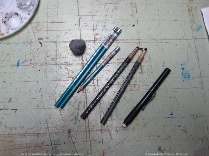
Here are some of the pencils I use:
Now, to be fair, the one I use the most is my mechanical pencil, a Pentel “Client” pencil. You can see it stuck in the rings of the sketchpad in the photo in the previous section, and it really is my “go to” pencil. But I started out many years ago as a civil engineer and drafter, and those always-sharp lines stuck with me.
I do use other, traditional pencils too, usually when I’m home and not on the road. I like the Prismacolor Turquoise pencils best, even though I’ve tried several others (like Kimberly/General). The Turquoise just seem to hold up better, last longer, and give me better lines. Other pencils seem to break a lot too at the tip, even when I’m just sharpening them.
The other two there are Prang charcoal pencils, which I use from time to time. I normally just experiment with charcoal, it’s not something I do all the time, but I do like how the Prang charcoals hold up. Not just that the pencils themselves seem to work well, but that the charcoal spreads evenly and is easy to deal with.
Erasers are always important of course, especially when I run my mechanical’s down to the nub. I use two types, more or less evenly. The first is a kneaded eraser, which is great to have. For one, it doesn’t leave any marks on the page when you’re done erasing, which isn’t necessarily true of other types. Being kneaded, I can also twist and pull it to get the right erasing size, which is very handy. It also doesn’t seem to leave as many particles behind, which is great for not being out of breath at the end of your erasing moment.
I also have a click-pen style eraser, something you can easily pick up here at the beginning of the school year. It’s great for travel, and also works great for more accuracy. The kneaded eraser can be twisted into a small shape, sure. But that doesn’t mean it will still erase in that small shape, as it deforms. The stiffness of the pen style eraser can come in very handy for that, and still doesn’t leave behind much residue. It is a little easier to break off pieces of the eraser, which can be a little annoying, but they still work well.
Ink and ink Pens
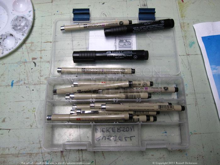
Since I started doing inks again last year, I started relearning all that I love about doing ink work. While sometimes I use nibs and brushes, I often use pens as well:
I use a fishing tackle tray/box to hold them (when I don’t have too many in there), which is a cheap idea for all art materials. The two black ones at the top are Faber-Castell “PITT” Artist Big Brush pens. Like it sounds, instead of the standard ink pen tip they are a small brush head. That works great, especially on the road, to be able to brush in large areas of black. They seem to be rated more lightfast than markers do, and they give a pretty deep black even on the cold press stock (though I often go over it twice).
The other pens are Pigma Micron pens, which I’ve always liked. They give a nice, consistent line, and work great whether I’m on the road or at home. Though I have a number of different sizes, I’ve always liked smaller lines in my art. So the ones that I use the most are the .005, .01, .02, and .03. I also use the .05 and .08 for larger lines, and after that I get into the brushes (brushed on ink or brush pen, either way).
The Micron pens have a very subtle sepia-colored line to them, something that’s not very easy to notice unless you put another color next to it. Most of the inks that I’ve dealt with, be it brushes and nibs dipped in ink or pens, have that subtle sepia effect, and it’s usually not a big deal. The PITT brush and the Microns do, as does the brush ink I use (we’re getting to that), but I have a set of Prismacolor ink pens that actually have a slightly bluish hue to them instead of the sepia.
If you’re scanning things in, that’s no big deal. Just drop everything to gray and voila–no color to worry about. But I’ve been working on original inks to sell, and, even being subtle, you can see the shade differences in the ink lines. If the store you are picking up ink pens has one of those little testing pages on the shelf, it’s a good idea to run different pen lines together and see if there are any shade differences.
I do also use bottles of ink, for brushing on and for nibs (though I don’t use nibs as much any more). For deep blacks, I tend to use Higgins Calligraphy ink (no. 44314), which seems to hold color well. For washes, I usually use Higgins Black Magic ink, or one of the other Higgins color inks if that’s what the art calls for. I like Higgins ink, I rarely get particles in it and it seems to degrade well when you’re using water with it for washes.
I have heard that acrylic ink will give you better, deeper blacks, but I haven’t dealt with any yet. That’s for the next experiment, though certainly there’s a concern there that, if the acrylic ink doesn’t have that sepia tone, it might stand out like a sore thumb.
2 Comments
Davina B. · August 31, 2011 at 10:05 pm
Nice. I’m always interested in what other artists use for materials. It’s been forever since I have been able to connect with other artists since like college! Tis sad when the need to survive pushes one’s need to create at times though.
p.s. I live off of Strathmore’s brand. Especially bristol board.
admin · September 1, 2011 at 9:02 am
Thanks! I do use quite a lot of Strathmore, though I do occasionally stray into other manufacturers’ papers. It’s definitely one thing I love about the web right now too, there are so many ways to connect with other artists, and see what they do.
Comments are closed.