So, I went ahead and did it. I signed up for my first ever booth at a major art convention, in this case the Spectrum Fantastic Art Live show in Kansas City in May, 2012.
What the hell was I thinking?
Now, before we get any further, let me just say that I’m very much looking forward to the convention, and the folks that run the show have been great to work with. But this is my very first “huge” convention to have a booth at, and to say I’m nervous is the understatement of the decade.
Sure, I’ve been a guest at a smaller con before, which means I’m not going into it completely blind. I’ve also had walls in local galleries, so I have a pretty good idea of what to put up and how to deal with the public. But it’s not going to be easy.
So I thought, instead of just whining to everyone on my social networks, that I’d write weekly articles from now through the event. I can write about the things I’m seeing as I get ready for it, what happens when I get there, and what happens after.
If you have followed any of my blogging or social networking before, you’ll also know that this isn’t going to be simply a step-by-step list either. My brain works in quite chaotic ways, so, if you’re willing, sit back and let me tell you tale or two.
The booth itself
Having walls in galleries before, I understand the ideas behind laying out your works in a nice way. Be it by medium, or content, even mixing things up some, there are plenty of different ways to do that.
If you have walls, which I don’t. All I have is a draped off, 10′ x 10′ area, no walls.
There are quite a lot of options to get “walls”, which are really panels of varying kinds. There are pegboard versions, metal “grid wall” panels, even fabric covered panels. I can rent them from the convention center, build some, or buy some.
I looked into renting them, but they are outside of my pitiful budget. But if this were the only convention I’d ever do, it’s certainly worth a passing thought. I also looked into building them, which, if you’re mechanically inclined, isn’t actually a bad way to go.
The local big box hardware place has pegboard (like a plywood panel, only full of rows of holes) for maybe $5-$20, depending on how big you want them and if you’re willing to cut them up at all. You can get a couple of 2″ x 2″ or 2″ x 4″ boards as sides for the pegboard, and either pieces of those boards for footing or hinges to hook a couple together (for support). All in all, not too expensive. They do have a certain look and feel though, being pegboard, so you might consider painting them as well.
You can look into buying panels too, especially if you plan to do more cons/shows. Metal grid panels, usually 2′ wide by 5′-8′ tall, vary greatly in price, but are generally in the $20-$50 range per panel. At 2′ wide, you need (probably) 12-18 panels to make your plan work. That’s quite a chunk of change.
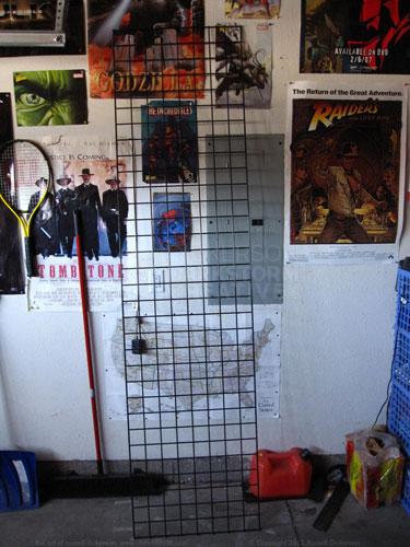
In my case, I turned to Craigslist. It just so happened that a local seasonal store (I’m guessing a Halloween store) was getting rid of a number of their panels. I made a deal with them for 15 panels, for a great price for each panel, and so I’m set on the booth. Here’s what one of them looks like. For comparison, my head (I’m 6′ tall) would be near the top of the Tombstone poster.
Which is great, I think they will work out well. But wait, work out with what? Do I even have enough art to fill a 10′ x 10′ space?
Laying out the art on the walls
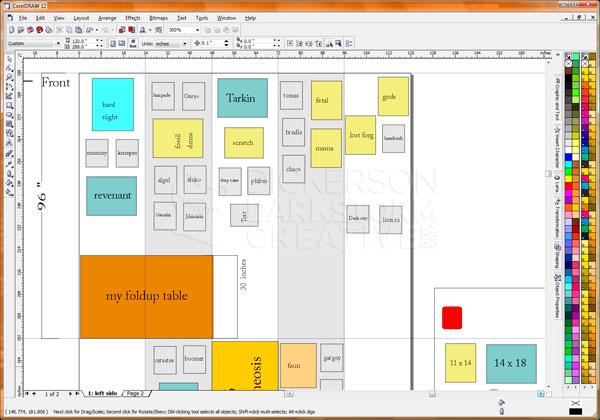
Possibly, but that’s where some planning comes in. So, I opened up CorelDraw (or Illustrator, it just depends on my mood), and started laying out the art on all the panels. I created a document that had the correct, real dimensions, broken up into each side/wall of the booth. Then I put the art that I currently have on there, measured accurately, to see how it would all work.
It becomes a real visual plan (most of what you see above is the left wall of the booth), before I’ve even tried putting together a test run of the panels in my garage. I can see what I have a lot of, with real measurements, and move stuff around all I want. I can add more pieces as they come along (I’ll be adding a new painting and several new inks this week), and I can see where things are lacking a bit.
I can also color code much of my art onscreen, to see how things work together. I can see which pieces of which type are next to each other, and if that works. It’s also a great visual representation of where I might be lacking. Case in point, digital prints.
Since I can print art at home, I only have bothered printing a few of my digital pieces. Looking at my layout, I can see there’s a huge amount of area where those can go. Now it’s just a matter of choosing some of them, and getting them printed and matted.
The panels themselves
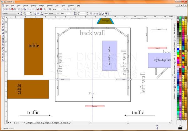
The other problem is, I’m making a lot of assumptions about my space by just putting (virtual) art on the panels. So, I need a second layout, this one showing how the panels, tables, and other items fit into the 10′ x 10′ space that I have. It looks sort of like this, a shot from above everything:
Same as before, this layout in CorelDraw is to actual size of everything. From here, I can see (in a virtual sense, anyway) how the booth will work. I know that the panels, at certain points, need to be connected either with a perpendicular panel, or with an angled panel, for stability.
I can also indicate where the front of the booth is, where traffic comes from, and how much space the panels really take up. I am also given an 8′ table (the brown ones on the left, off the page) if I want it, and I have a small table of my own that I’m bringing. I can add either one in to the layout, and see how much real space there will be.
I want to make sure that the booth is easy for folks to get around in, and not have any areas where they might get stuck. Having a “U” design (table in the middle), for example, might cause a blockage of people looking at art. If a line gets blocked, people get trapped in the back, or others who are coming in skip your booth because it looks too crowded.
It’s all a work in progress, but laying things out digitally gives you a pretty good sense ahead of time (even before a practice run) to see how it will all work out.
