I just received the new Maelstrom Set III from Thunderstorm Books, and as usual with Thunderstorm they are exceptionally crafted. I’m lucky enough to have created the foil stamp designs for the hardcover, and hopefully they go well with the gorgeous dustjacket art that David Ho created.
As with the foil stamp designs I did for the previous Maelstrom sets (here and here), the art is created as vector art. That leaves only one color to use, so it’s an awful lot closer to being an ink than anything else. But even at that, while the stamp process produces normally clean lines, it can’t do the level of detail that traditional inks (or digital raster art) can accomplish.
So, whenever I design imprint art like this, I have to separate the ideas that would be wicked cool with the ones that are practical. Luckily, just because the art is vector-based doesn’t mean it has to be all straight lines and standard shapes. Often, especially having done quite a few of these now, I can usually balance cool and practical quite well.
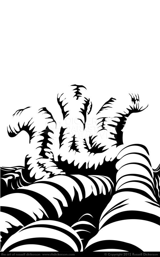
Case in point, my first imprint for Brian Keene’s book Deluge. Deluge, for those that don’t know, is the sequel to the book Earthworm Gods (or Conqueror Worms for you mass market paperback folks). Deluge involves lots of things, and Keene is a great “visual” author, but the one image that stuck in my head was the giant worms crawling over one another. I decided to go with that idea, and here it is, set as it would look on the page (click on it for a larger version):
The two tricks with this one were both with the look and feel of the worms. I wanted to make them look organic, with not so many clean lines. I wanted them crawling over one another, a mass of horror gliding through the image away from us. The second challenge was, using only black, to indicate not only the texture of the worms but the light and shadows as well.
It can be tough to let the outlines of objects go too, as this one does. I purposefully left off outlines around the worms, and tried just to use indications of where everything is going and located. That means the viewer has to come along with you and see where you are going, and can be tricky.
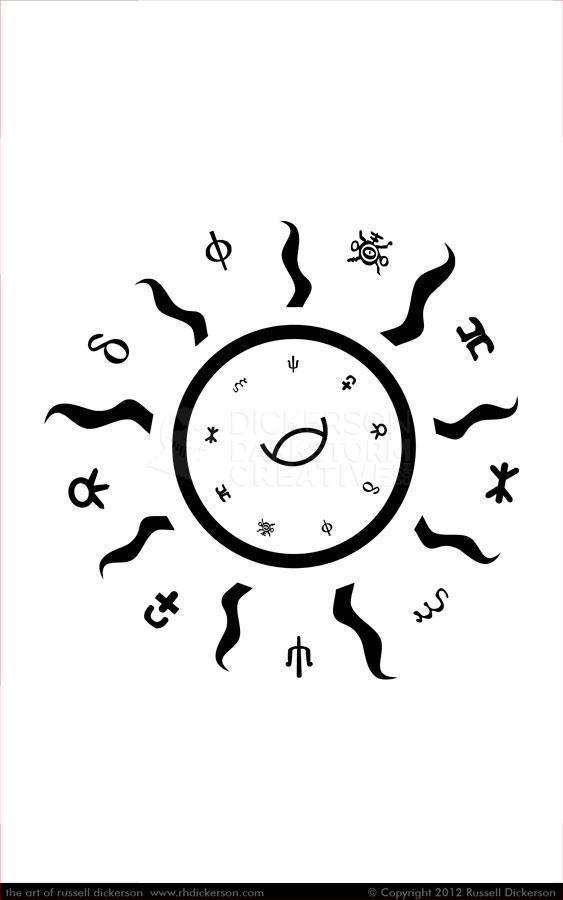
The second image was a bit simpler. For Brian Keene’s book Sundancing, the publisher (the great Paul Goblirsch) wanted to have just an iconic sort of design, using the strange symbols that appear within David Ho’s cover.
We decided to create a symbol of the sun, with flares coming off, and smaller symbols in between the flares. I was shooting for the mysterious side on the final design, to give the cover the feel of that this book might contain some of the weird secrets of the universe. Here it is below, set as it would look on the page:
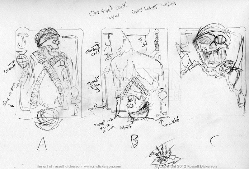
The last imprint design, and by far the most complex, is for Geoff Cooper’s Answers of Silence. Paul was looking for a unique playing card design, based on the jack of spades, with a soldier of some kind. I sketched a number of ideas, with various soldiers and techniques, and I tried to keep the mirrored idea that most playing cards have.
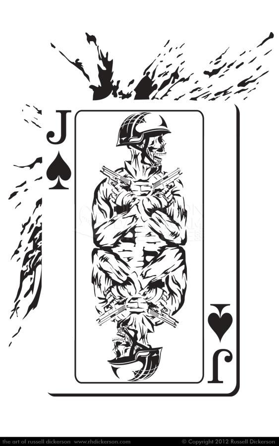
After some discussion, we settled on (more or less) version A, and I went to it. I altered a few things, and we tried a couple of different versions, before coming up with the final design:
Again, like the worms, I left the edges of the card without a border. When I added the blood splatter to the background, it really stood out nicely, and I thought added a great dimension to the idea.
I had to work with the mirror side a bit with the soldier, where they meet, but otherwise the original design idea worked well from the construction standpoint. I changed the idea from having crossed bullet belts to crossed arms, I felt it was more dramatic and offered more of a statement.
Imprint design is a lot of fun, and I hope I get to do a lot more of them. They can be a challenge sometimes, but in the end I think that the further thought I have to put into them makes me a better artist.
