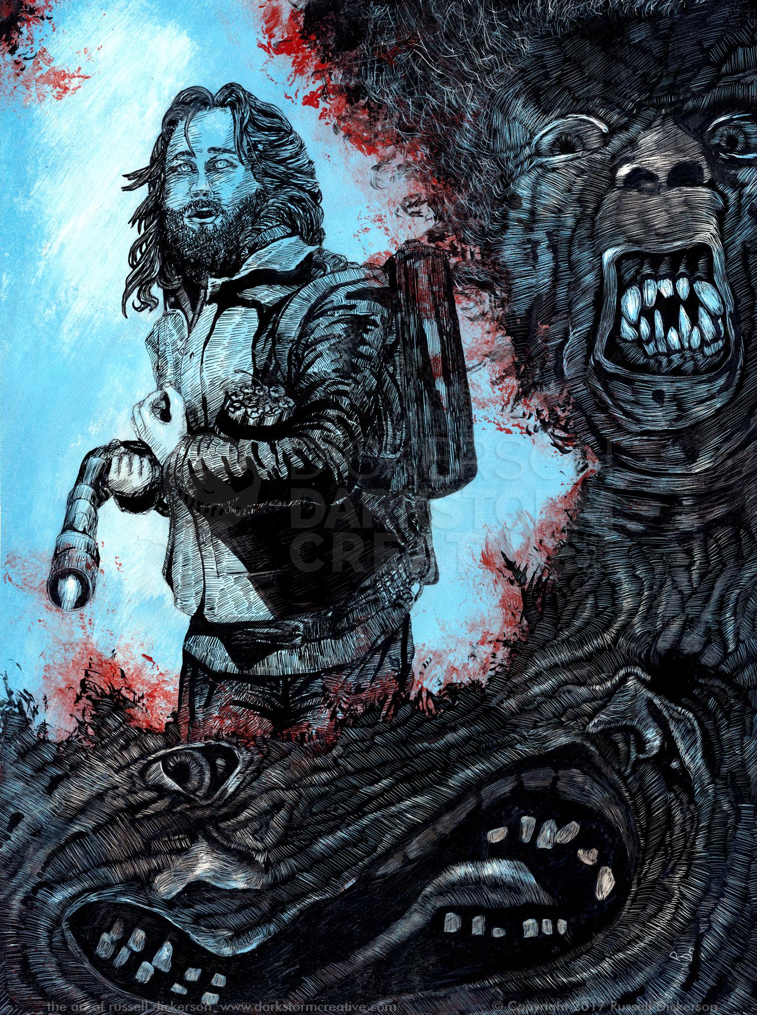
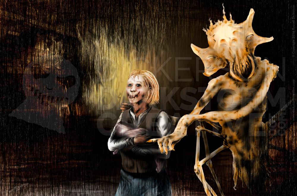
A little while ago, author Brian Keene asked if I could do the cover for his ebook release of Scratch. I created the art for the previously released limited edition book from Cemetery Dance a few years back, and he wanted me to adapt one of the interior illustrations I had done for that set as a new cover.
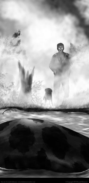
The challenge was that Scratch was printed at a special “novella” size, very tall and not very wide. Covers for ebooks are far more traditional for sizing, like a typical trade paperback. Here’s what the original art looked like:
To adjust to the new layout size, I opened the art in Photoshop and began to adjust it. Since I have a tendency to work in layers in Photoshop anyway, I already had an advantage. I didn’t have to recreate the wheel, so to speak, as much as just rework certain elements to fit better.
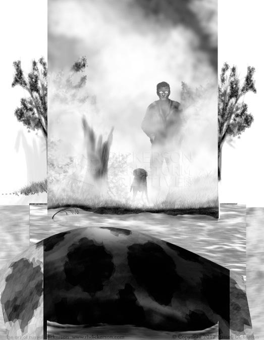
I expanded the layout to the new cover size, and realized that when I had created the original version I had left a number of layers far wider than the size needed. Objects had been merely off the page, or masked so that they wouldn’t show up. Here’s what it looked like in Photoshop as I started:
That meant that the snake was all but done, which saved some time. I removed the masks that had been in place, and then recreated anything on the sides that needed to be set.
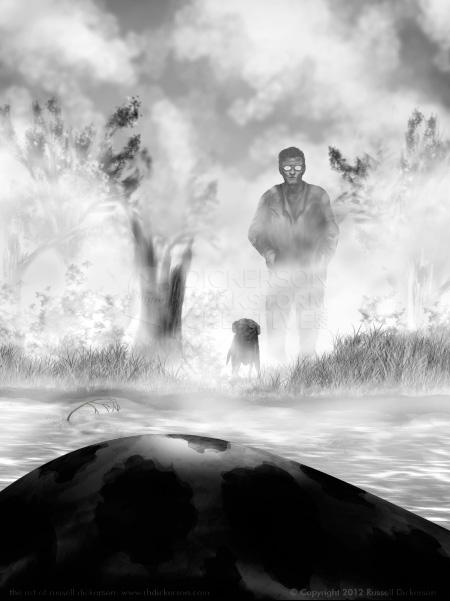
Now, in the course of the years since I created this, my techniques have changed some. So part of recreating the art was to match those previous techniques, so that the cover didn’t look wildly different in spots. The only major style change was in the sky. Rather than try and recreate those clouds, I used my newer techniques to make a brand new sky.
Here’s the finished grayscale version:
Now that the base version was completed, it was time to add color. I sometimes will create with color from the beginning, other times I create a gray image and then color it. Since I’m used to coloring in gray, it was easy to just pick up and go with it, no change in technique needed.
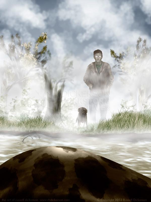
Though, usually when I go from gray, I’m looking to have a higher contrast, more realistic color scheme. But I didn’t want that here, I wanted the background to be desaturated. With the fog, and the way the story plays out, I thought strong colors would throw off the idea. Also, I did want the snake in the forefront to be strongly colored, with high contrast, so that it was the true focus of the art.
So, instead of coloring the way I normally do, I relied on Photoshop’s Adjustment Layers to create a desaturated look. I used more or less solid colors on each of the layered pieces, which gave a flat look to the background. Normally, there are quite a few colors and contrasts that go into the art, giving it depth and life. Leaving that off gave the background a more mysterious flat look, and the sharpness and strong colors of the snake bring your eye right to it.
Here is the final cover art, fully colored and ready for the text (click on it for a larger version):
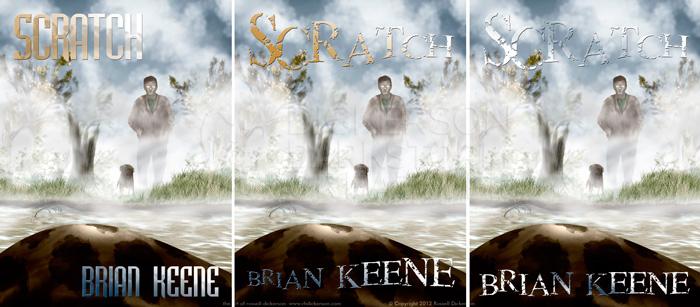
For the title and author’s name, I toyed with a few different text ideas. Unless the client has a strong idea, I usually create a somewhat normal layout idea, then a couple of other options to challenge things a bit. In this case I created two real layouts, and a third that was slightly different:
While I like the far right one especially, for the sake of marketing and cover recognition the first one was the better choice. Stronger text, better contrast on the art, and simply easier to read. It’s less “iconic”, sure, but readability-wise it’s a stronger cover for the business side of things.
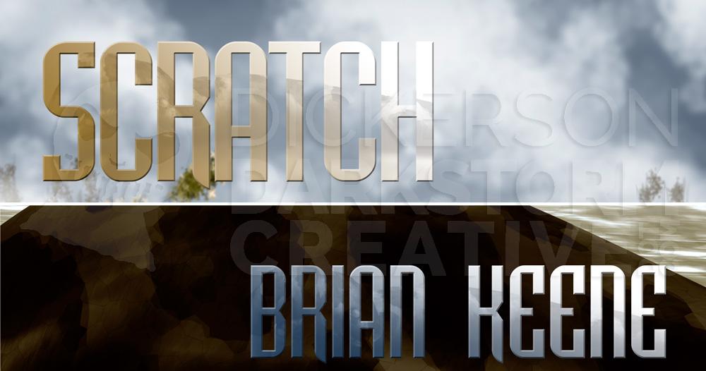
But I did get to play a little bit with it. In the text itself, to give it some definition against that background, I added a texture. The texture happens to be the snake itself, culled from another art piece I did for the project originally, called Death from on High. Again, click on the image for a larger view.
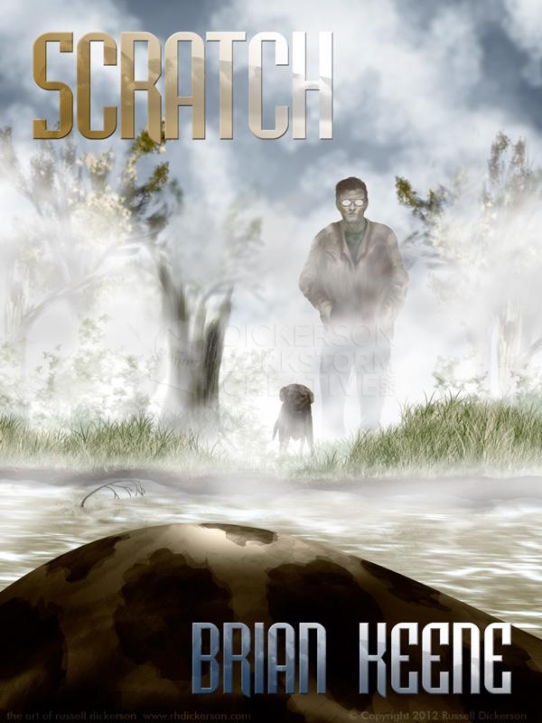
Here is my final, full version of the cover art for the new ebook release of Scratch, text and all. As usual, let me know what you think of it. Also, go buy the ebook version, since it is, after all, an awesome Keene story.
