I recently had the opportunity to do a new cover for Steven E. Wedel’s book Murdered By Human Wolves, a book that I’d heard about originally a number of years ago. Especially because my friend Kirk Alberts, who is an incredible artist, did many of Steve’s covers in the past.
To do the art for this one meant I had a lot to live up to. Kirk’s previous covers were nothing short of brilliant, and being a friend of mine I didn’t want to disappoint him (or Steve, or publisher Graveside Tales) by coming up with something substandard.
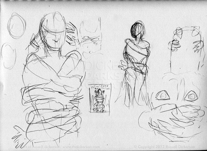
So, as usual, we started with the rough thumbnail sketches. In this case, as happens sometimes, I had sent an explanation of what I was doing. The woman from the story would have wolf hands on her, being nice, and doctor’s hands on her, being… not so nice. As with all images on this page, just click on it for a larger version. In fact, on most of them you’ll want to see the larger versions.
From my wild chicken scratches, and the explanation in the email, they could see where I was going. There was some discussion of front cover versus wraparound, but in the end I merely let the background cross slightly on to the back. More on that later.
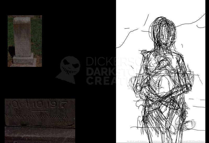
I had reference photos of the real life gravestone for the main character, which actually does read, “Murdered by human wolves”. I left that on the back for reference, as well as having one of my anatomy books kitty-cornered on my laser printer, and did a more exacting sketch.
Okay, I realize it doesn’t look any more “exact”. Partly, that’s because this is all of the 5 sketch layers combined, so they run into each other. Normally some of them would be hidden. The other side of it is that sometimes I really do just start with a framework of sorts, and create from there a little more organically.
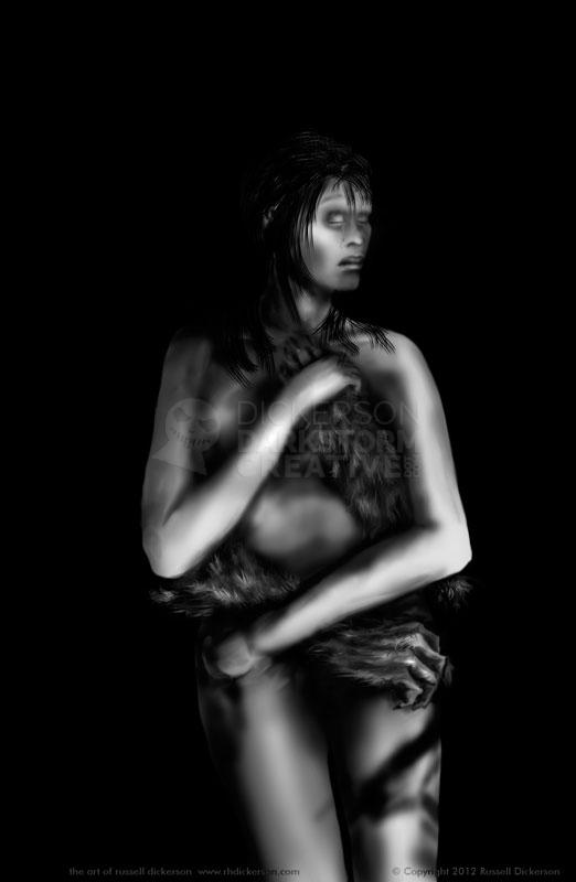
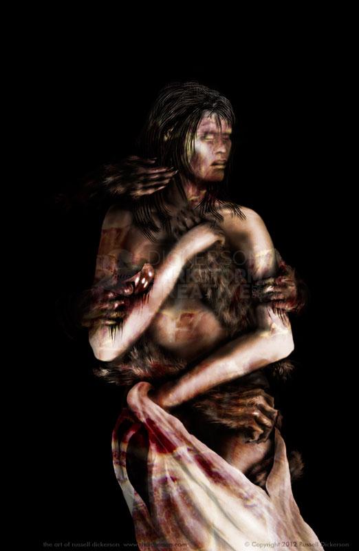
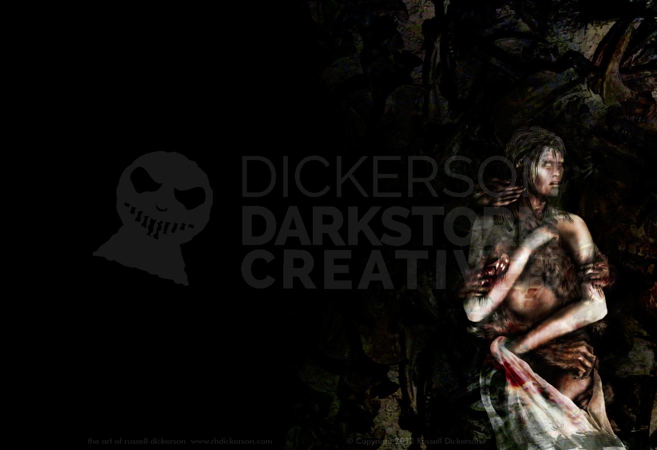
After the sketching, I painted in the figure, and tried to get most of the shadows and general tones all set. Instead of multiple layers for arms, the head, and even the wolf arms, I opted to paint them all on one layer.
Now, you’ll notice her hip is a little weird on the left (left to us). That’s due to shadowing and other effects that I was working on after this point, instead of creating a different layer I just manipulated this one. You can see it on her other leg too, all the weird black patterns.
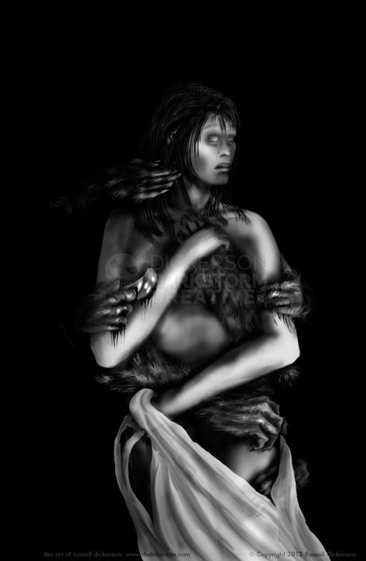
I then decided to add more wolf hands, and the cruel doctor hands. I also wanted to add a semi-transparent shroud, either that she’s holding up or letting drop (your choice). It gets lost behind the text later on, but I did like the hand going under the shroud.
From here, being more or less happy with it, I decided to add color. In this case, color was on two new layers. One of them was basically just airbrushed color areas, and the other was a texture that I kept manipulating to get what I wanted (mostly with the healing brush, dodge/burn, and smudge tools).
Now, for me, when that color and texture hit this moment, it was like a big POP! This is the moment where I started thinking that it might not actually turn out ridiculously awful.
You might laugh (you might not, you might think it really is awful), but for me there’s a big stretch when I’m working where the art could go either way. When you’re seeing it onscreen in a half finished phase, and it dies a horrible death. I never, EVER let people see that stage onscreen. I’ll literally switch it over to Chrome and make whoever is in my office think I’m screwing around on Facebook instead of working.
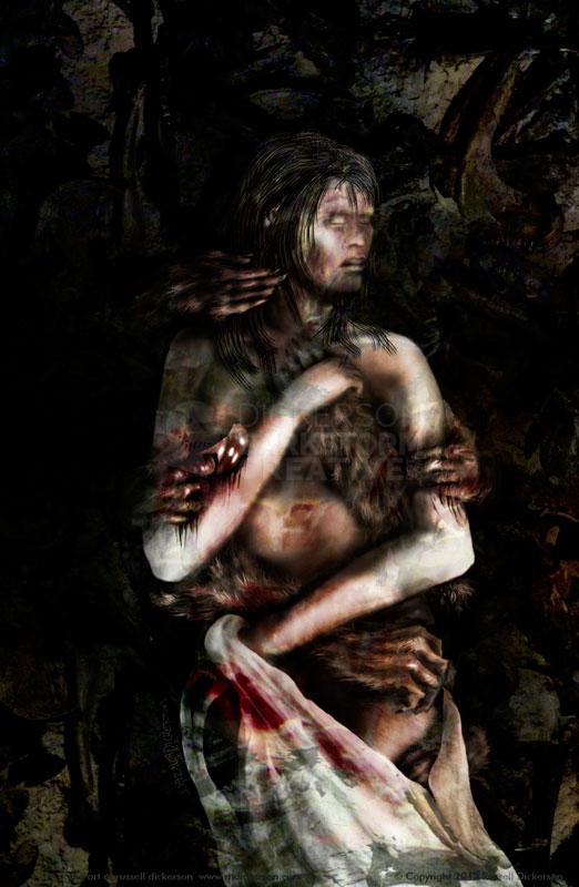
I liked where it was, but it was missing something. The background was just too simple, but the arms coming from behind really needed to stay in the dark to keep the effect. Otherwise, they would look like oddly floating, unattached arms. That is horror, of course, but not what we’re looking for.
So I flipped through my big directory of texture photos that I’ve taken, looking for the right one or the right combination. After going through a bunch of them, going back and forth, working with layer blending modes and hand-drawn effects, I came up with this:
Those textures look like this, unadulterated:
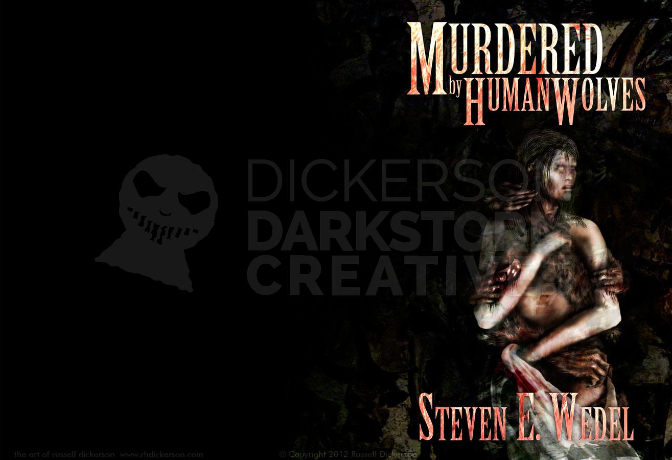
After floating the look of the cover past the author and publisher, I added the cover text to it. After a couple of different ideas, the final, printed cover, with text, will look like this:
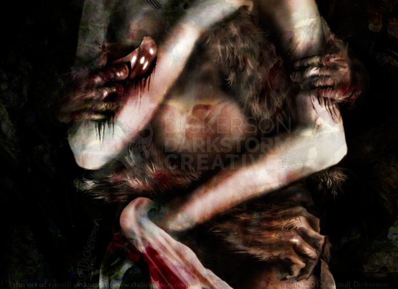
Since it’s sometimes hard to see in the full image, here’s a closeup of the woman and the hands. Eagle-eyed readers of Steve’s work will also notice a subtle (unless it’s not subtle) symbol that shows up here as well, a symbol that appears within the story and in later books in the series.
Here is the full final version (you have been clicking on all of them to make them bigger, right?) of the cover art for Murdered by Human Wolves. Story by Steven E. Wedel, and soon to be available from Graveside Tales.
