A number of years ago, I was commissioned to do interior art for a Cemetery Dance project. Working with Cemetery Dance is great, and I jumped at the chance to work on a new anthology for Dark Delicacies.
I had the chance to create art for a story by William F. Nolan, called Depompa. It was a fun story, and I was lucky to get to work on a story for one of the true icons of writing. The book itself, for various reasons, was quite delayed, which happens. It did get printed, though it was during my rather long experiment in what the world calls, “unemployment”, so I missed it.
But I’ve always liked the ideas behind it, and (for the most part) how it turned out. After the years that have gone by since, there are a few things that I would do differently. I won’t bore you with all of that, I feel it’s a good look back at how I did things then, and ideas I can be proud of.
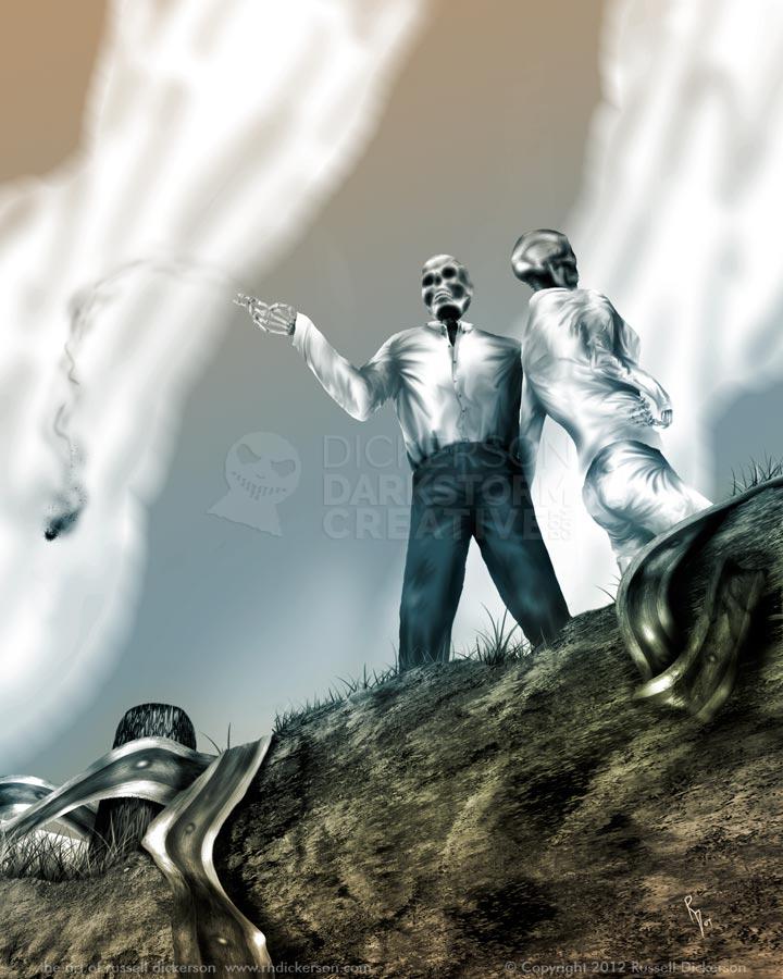
It’s one of the illustrations that I’ve done that I ended up taking a bit of leeway with. I think, in illustration work at least, you have a couple of ways to approach the work. You can create what you feel is exactly what happened in a scene from the story (to the best of your ability), or you can create something that has the intent of what happened, if not the details of it.
In the case of this one, as you can see in the art below, I’ve taken just a little liberty with it. The people in the story aren’t really skeletons. But it infers the reality of the story, that these people have a death wish. They are standing as they do in the story, overlooking the cliff where the car went off, twisting the guardrail into a mass of wreckage.
I’m usually fine, as a reader, seeing the artist’s interpretation of the story. There’s certainly a fine line when you’re dealing with a representation of a scene, versus creating the literal elements. But if it’s done well, and it seems inspired well by the story, I’ll go with it.
I hope in this case you do, and I hope you pick up the book from Cemetery Dance if it’s still available (here). Over the years I’ve come to call it Fast Lane Blues, and this is the first time it’s been online. I have had it for sale as a print at a few conventions, and it’s been in my portfolio, but otherwise this is its first light of day.


1 Comment
New Art: Of Life, Death, and Afterlife « Darkstorm Creative: The Works of Russell Dickerson · December 30, 2012 at 3:44 pm
[…] like the last piece that I posted, this digital art that I created hasn’t been seen before by the masses. It’s digital, […]
Comments are closed.