I’ve been doing hardcover imprints for Thunderstorm Books for awhile now, and it’s something that I always enjoy. This time, I needed to come up with an image that was of a gunfighter, with a little bit of a sinister twist.
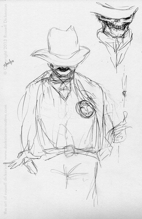
Now, many of you probably don’t know that I do love westerns. So the chance to do a gunslinger like that is pretty cool, and from the start I had a pretty good idea of what I wanted to try. So, like most projects, I sent Paul (owner of Thunderstorm) a thumbnail sketch.
Luckily, I’ve been working with Paul long enough that he probably recognizes my chicken scratches. He thought it was a good start, so I went to it.
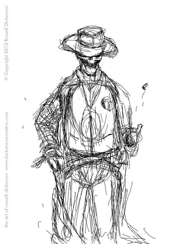
In Photoshop (as I have a tablet), I sketched out a pretty good version of the gunslinger. It basically sits in the background of CorelDraw (or Illustrator), and I then would add all of the shadows and art on top of it. Removing it at the end gives me the final art.
I kept going back and forth between the vector version and this sketch, trying to get the shadows correct. But I couldn’t commit to the proper angles of the light and shadow, mostly because my brain was split between the sketch and the one color imagery of the vector art.
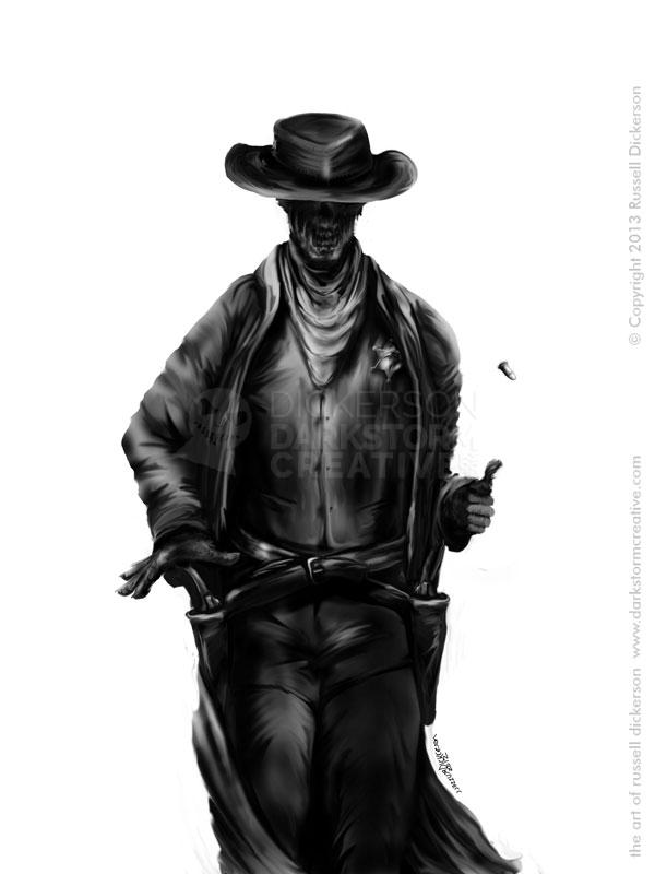
So I decided that the best way to get around it was to fully illustrate my cowboy of the dead. It came out something like this:
Doing a full illustration allowed me not only to get the shadows correct, but I could also flesh out some of the subtleties of the cowboy itself. A little more swing in the hip, slight angles here and there, and overall I managed to build a bit more character into it.
Then I put the whole works back into Corel, and built the shadows over the top of it where they should be. The trick, as I’ve mentioned before in this kind of art, is that you only get one color. So, while this illustration helped quite a bit, at the end of the day it’s only a guide. I have to be able to convert the idea of this nice, grayscale image and all of it’s textures into a single color image with no gradations.
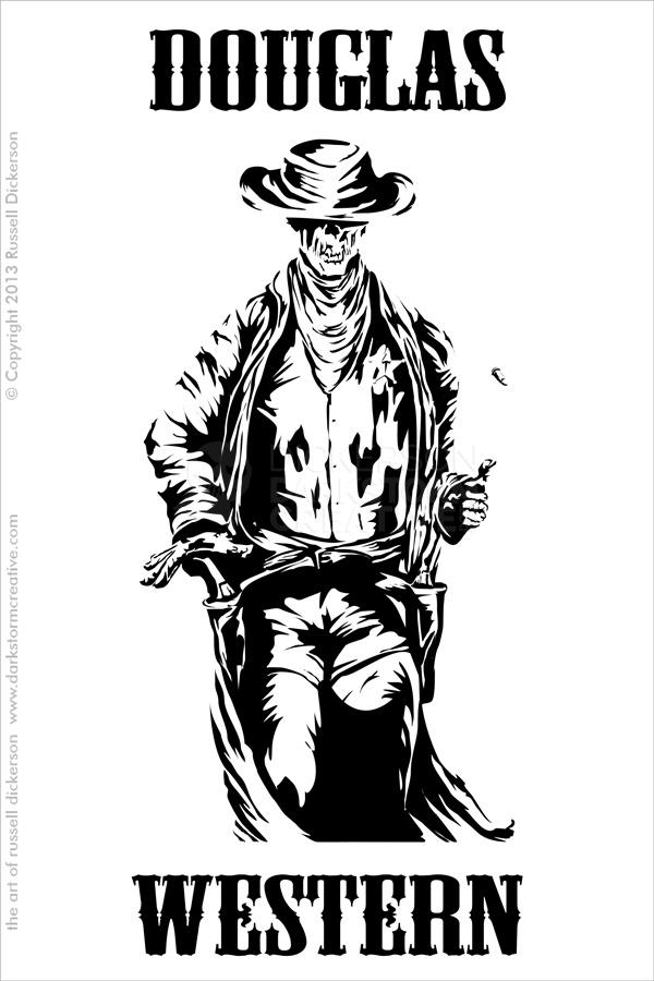
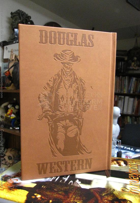
Here’s what he came out like at the end, with the “Douglas Western” text that I added for the cover:
After I sent it off to Thunderstorm, Paul sent it on to the print shop to imprint it into the beautiful hardcover of Walk The Sky, by Robert Swartwood and David B. Silva. The final book looks like this, with the imprint set into the leather:
I love working on these types of projects. They are a great challenge, and quite different than the normal illustration work that I do. I look forward to doing more, and I hope you like this one.
