Awhile back, I was lucky enough to finally meet an author in person that I’d known online for a number of years. Then the author, Michael T. Huyck (go visit his site, people), asked if I could do some tattoo art for him.
I’ve had the question before, but I’ve never made it to the final stage of tattoo art. Sometimes I don’t hear back from the interested party, sometimes it just doesn’t come up again. In the last few years, it’s been the destruction (and, eventual resurrection) of my art and career that have kept me from getting into things.
But it worked out this time, and I think it worked out pretty well (opinion). I’ve been on a bit of an art hiatus since the end of last year, mostly trying to decide if I even wanted to do art any longer. Projects like this are easing me back towards art, which is probably a good thing.
I will say, getting back towards art with a different outlook about the entire thing. Both my own outlook, and how I would interact with others in this whole art thing. But that discussion is for a different day.
The tattoo idea that he had was at the same time specific and vague. That’s often how things get started, sometimes great things, because it can mean that the client is welcome to new ideas. That’s not always the case. Usually people do approach me for my particular style (one that I don’t think I have), but they still have their own ideas about what they want.
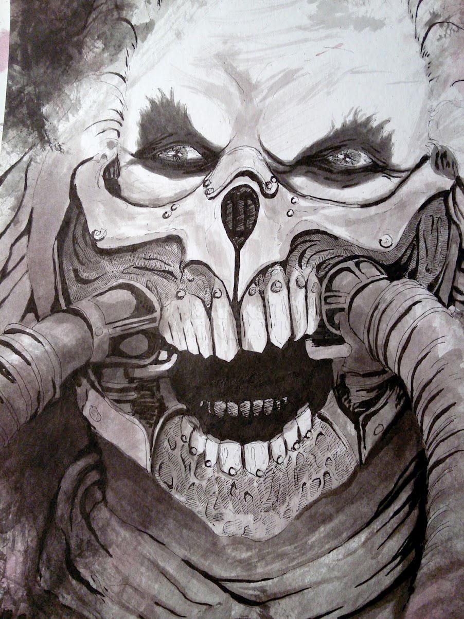
What we discussed was a man in a hoodie, looking down (probably). He would be half elderly, and half skull, with a strong sense of darkness.
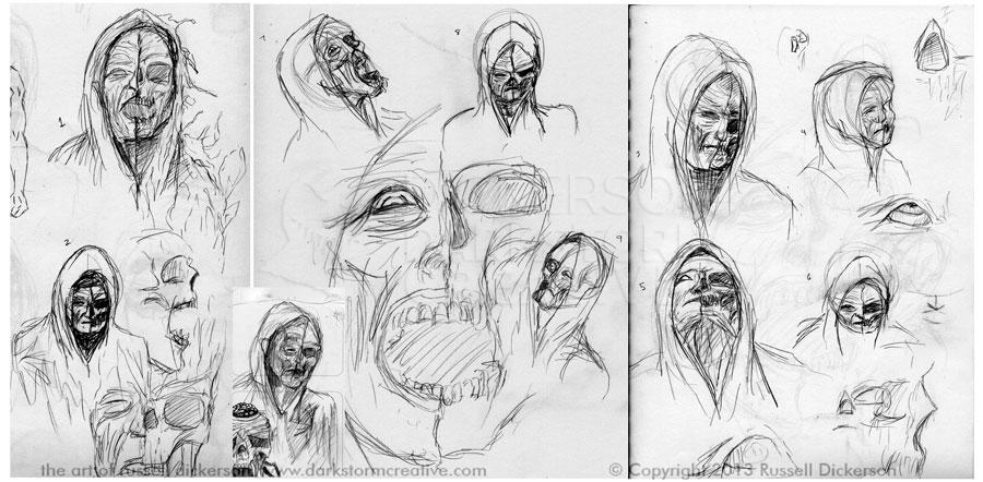
Now, both of you that read that (there are still the two of you here, right? Hello?) are going to have a different vision of what that might look like. So do I. The best way to start then is to simply sketch it out. I started kicking out thumbnail sketches, and we took pieces of them to whittle down what we wanted.
Here are some of those sketches, click on it (and all of the images) for a larger version.
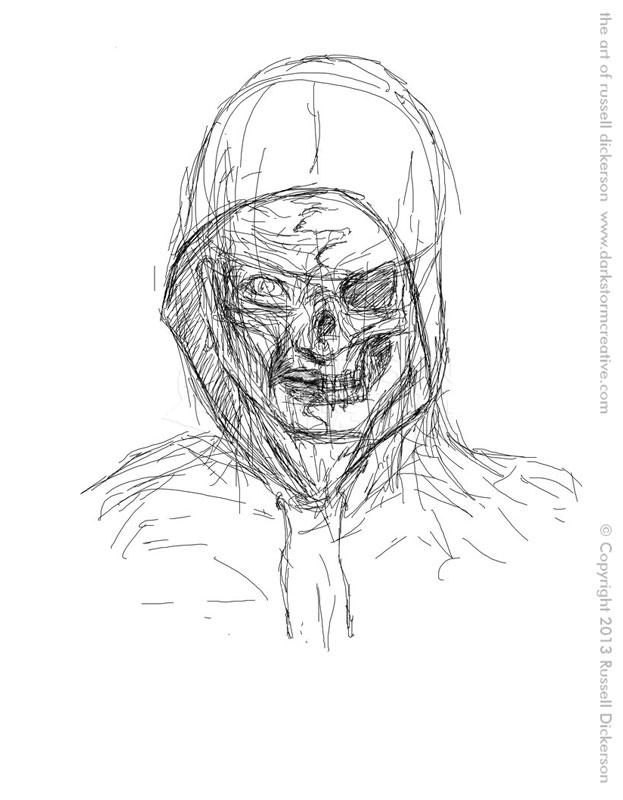
We talked back and forth, and eventually settled on a look. It could change some, and always does as things get going. But here’s the initial sketch on the file itself:
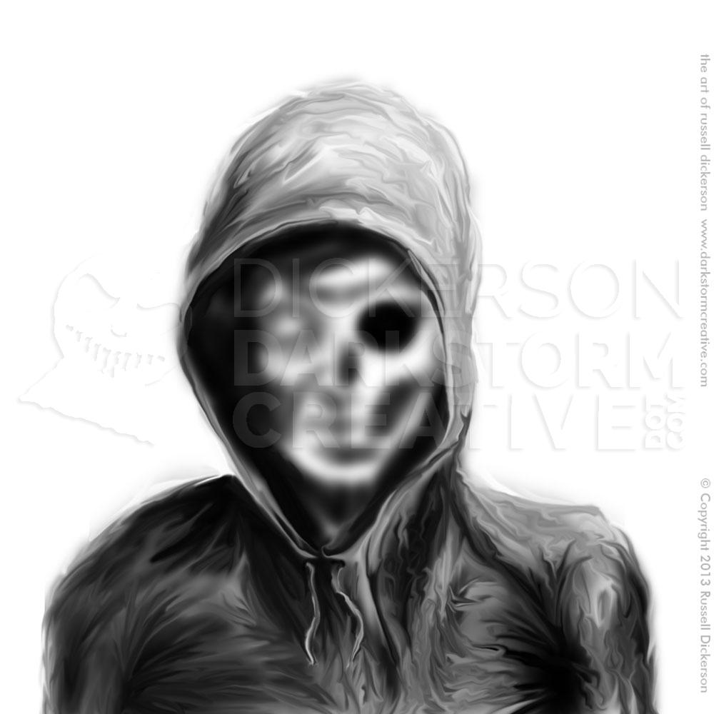
Now, from here there are several million ways to begin (or, if you are my daughter, “bajillion”). In this case, I just started with Photoshop’s airbrush tool, as well as smudging things as I went for a certain look.
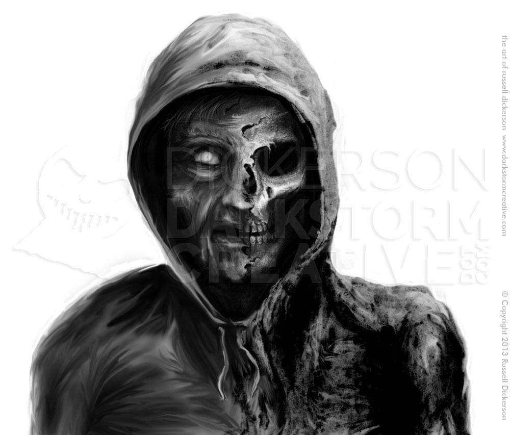
This one is mostly just the base shades, and roughed in ideas. It’s enough to see where things are going, though, and if you click on it, the larger version might show some of the nearly transparent sketch. I usually just follow that sketch at this stage, smoothing and texturing as needed.
From here, I just keep pushing and pulling until I like what I see. As you can see, the left side is smoother, while on the right there’s a lot more texture. I thought that worked well, and set the sides apart from one another in many ways.
Since the concept of an “old man” is open and fairly vague, I was heading towards a look similar to Tommy Lee Jones. Lots of wrinkles, but a fairly tight face overall. I wasn’t sure that’s where we needed to head, but it was a good place to reach and start the discussion.
I also added some minor texturing in the skin on the left, and a bit more overt texturing on the right. I liked how it looked, so I passed it on to Mikey.
We had a discussion about it, and decided to edit it some. He liked where the texture was going on the right, so I ended up adding a lot more. He felt that the man should have more of a “saggy” look, like a very, very old man, so I reworked it to get that look out of it.
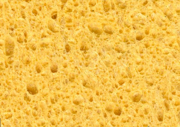
When I was looking at how to texture the right side, I came across this photo in my files (it may also have been originally from Spectrum Textures, a great site):
I toyed with it in Photoshop, in the layer blending modes over the old man, and something fascinating happened when I turned it to “Color Burn”. It happens sometimes when the texture is absolutely perfect, and adds a dimension to the piece that was unexpected. As soon as I did it, I saved a copy and sent it right off to see what he thought.
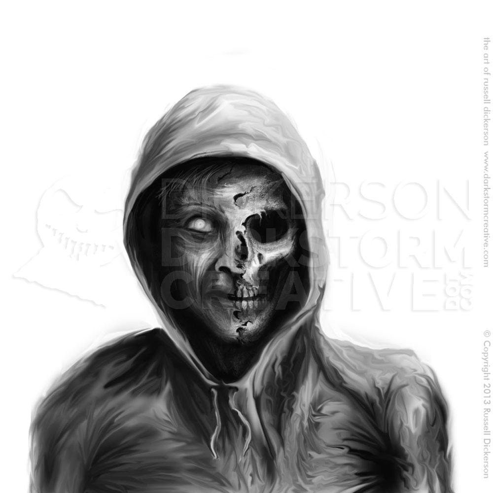
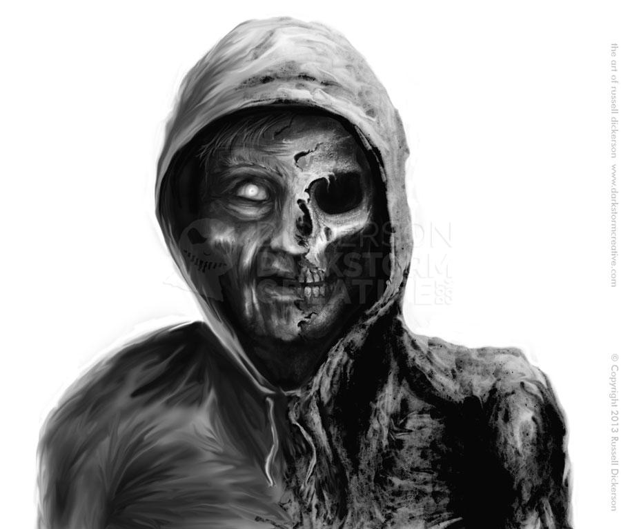
Myself, I nearly giggled at how the texture on the right came out. It was just… malevolent. What do you think (larger version especially):
That was, as they say, the cherry on top. Now he looked elderly on one side, and absolutely malevolent on the other. I even hid each side at a time, to see how each side looked independently. I thought it worked great, so I made some last changes, cleaned up the messy parts, and we called it the final piece.
Here’s the final art, which I call Old Man Darkness. Let me know what you think of it.
Go check out Mikey’s great discussion of the art as well, and what he was looking for in it. Make with the clicky.
1 Comment
Digital Art: Old Man Darkness Revisited » Darkstorm Creative: The Works of Russell Dickerson · April 26, 2014 at 4:53 pm
[…] year, I created a tattoo for the great author Michael T. Huyck, Jr., based on an idea he had (see it here). Being that it was for a tattoo, I created it as a grayscale piece to keep things […]
Comments are closed.