I’ve been trying to create a new art piece every week, and soon I hope to make that every day. Until then, I’m enjoying the personal projects and ideas that I’m exploring. I have quite a few ideas for digital pieces, stories, ink art, paintings, even sculptures.
Digital art allows me the greatest level of tinkering, which is one of the reasons I love it. Case in point, this week’s new art.
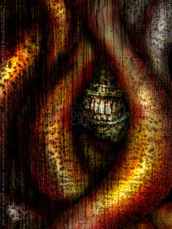
This piece, which I call Conquered, is a great example of my tinkering. The face and the tentacles are traditional illustration. I crafted the face and the tentacles with paint brushes in Photoshop, and the face itself was based on a pencil sketch that I created earlier. The textures are photographic and other texture methods that I laid over the brushed art, then manipulated with hand tools.
By hand tools, I mean to say things like Dodge and Burn, Healing Brush, and other tools like that. Those aren’t really paint brushes or shapes that are created, but they still require a stroke by stroke method to work out what I want.
On top of that, I decided that the graphic design side of my brain needed a workout too. I laid Edgar Allan Poe’s masterpiece The Conqueror Worm over the top, in an appropriate font. Then I worked with the layer blending modes, and some hand masking effects, to get what I wanted.
What I didn’t want was just text laid over the top, clear as a bell. I was using the text as a texture, with only hints of what it says here and there. It’s less about the text and more about the effect, so I’m happy to anger those who want that text clear in all spots. If this was a publication about that poem, then I certainly would have planned it differently.
So, here’s the final art. Let me know what you think, either in the comments or through my fancy social networks.


2 Comments
Glendon Mellow · September 28, 2013 at 10:47 am
Wow! I didn’t notice the text before! Amazing effect. Like little tiles. Adds a whole other dimension to the spooky mouth and organic structures.
rhdickerson · September 28, 2013 at 10:50 am
Thanks Glendon! That’s why I added it, that “extra dimension”. I thought it added a nice feeling to the whole piece. Well, “nice”. 🙂
Comments are closed.