Most days, a billion ideas are running through my head. I think the better ones tend to stick around, and then it’s a matter of putting them into action.
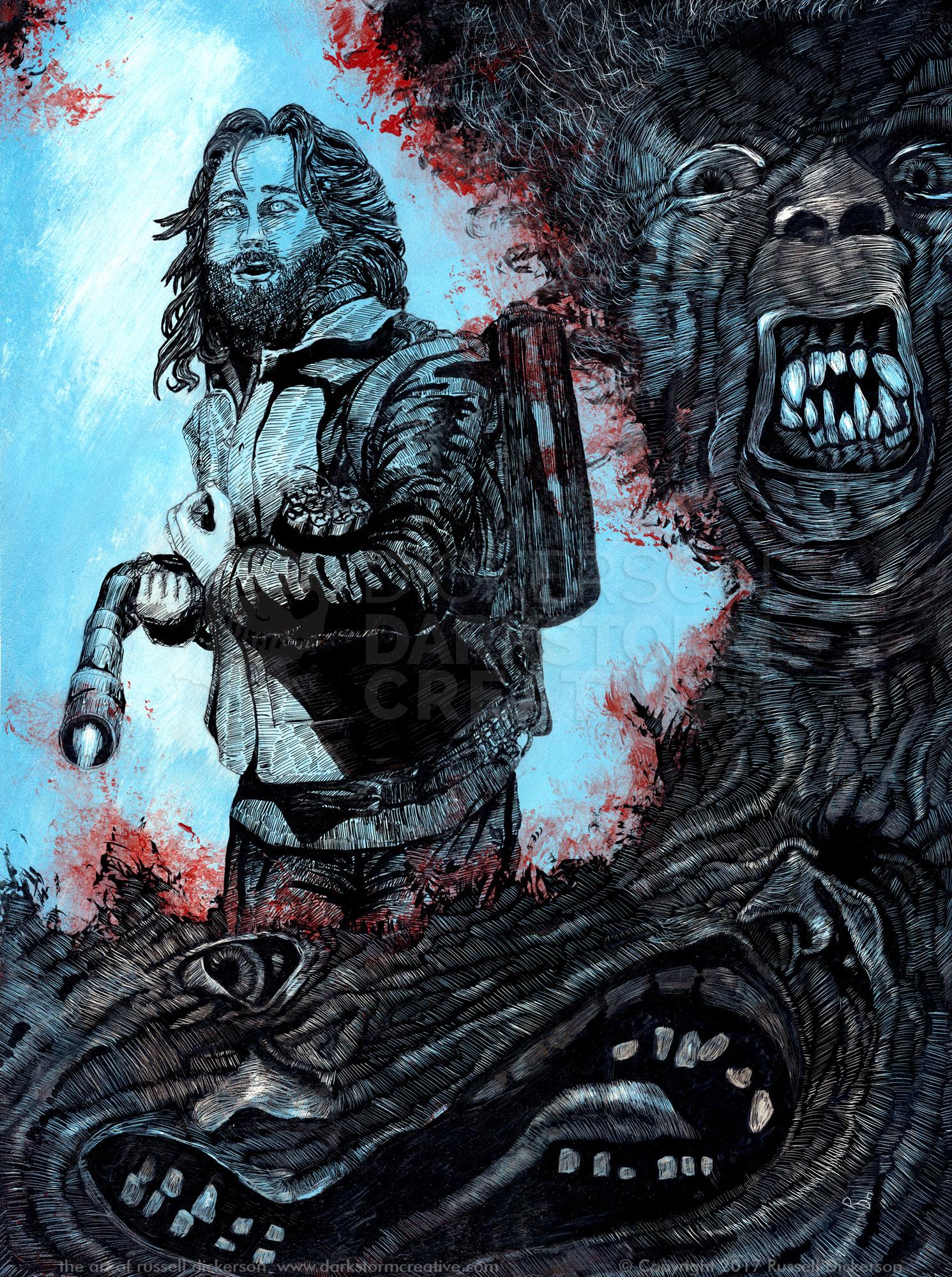
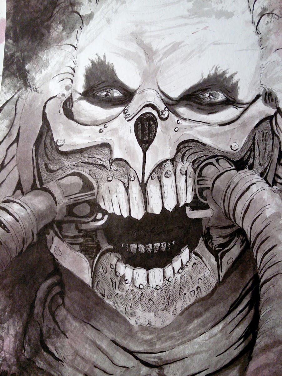
I’ve learned through years of experience that some ideas work better in specific mediums. For example, the last work that I did, Waiting for a turn (here), really had to be an ink. Sure, I could make it work as something else. But it clearly cried out to be an ink over anything else.
When it comes to my own ideas, especially, the medium comes to light a little easier. With published projects, they are mostly digital for a myriad of reasons. But digital does lend itself to the random starting points that inks do not. I love doing inks, but you really need to have at least a general plan in mind before you get going. You might even need a fully sketched piece to go from, since ink is unforgiving.
Digital art, especially working layers, allows for a lot of choice as you are working. Layers can be changed, techniques tried and abandoned, and even, as in this case, a true working of an idea from beginning to end.
For this piece, I had no idea what I wanted it to become. I just knew that I wanted to create something that day, and with it being the end of my self-imposed hiatus it turned out to be a bit difficult to make those first few moves. I’ve certainly said it many times before, the very hardest part of any project for me is that very first line.
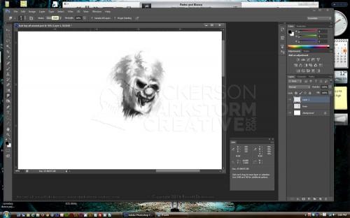
In this case, it was almost terrifying. I was in a frame of mind that the first line could begin my second coming as an artist, or it could be the very last line I ever created. After a few minutes, I had created a head (click on it for a larger version):
Believe it or not, it was this very moment, this very face, that decided if I should give up the whole game or not. It had been a long time coming, through a lot of strife, and this face represented where the rest of my career was going.
Now, it didn’t need to be perfect, mind you. I just needed to see if I still had gas in the engine, so to speak, and if I really cared whether I did or not. Reaching this point in my life wasn’t easy, and there are still roads to follow. But I saw a spark in it, so I kept going.
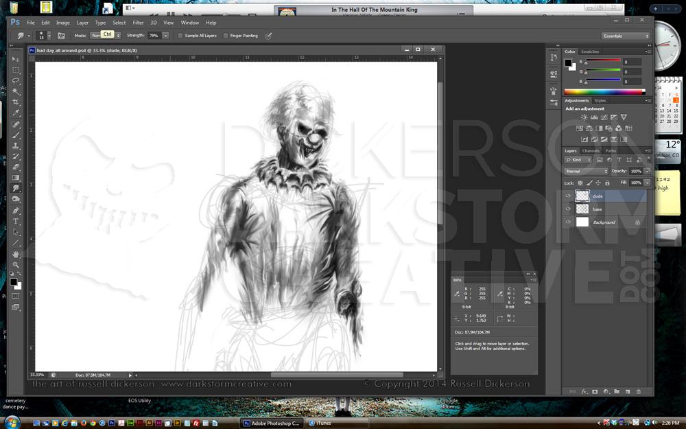
I drew in a rough sketch of framework for his body, based on the head. I then decided that a clown would be fun to create, so I airbrushed and smudged my way into a decent, somewhat malevolent clown.
Once I made it to the torso, I almost immediately changed my mind from the original idea I had with his arm. I was thinking about what he should be carrying in his hand, and at the same moment decided I didn’t like the idea of his other arm across his body. You can see the rough horizontal lines around mid-torso, that’s where his arm was going to be.
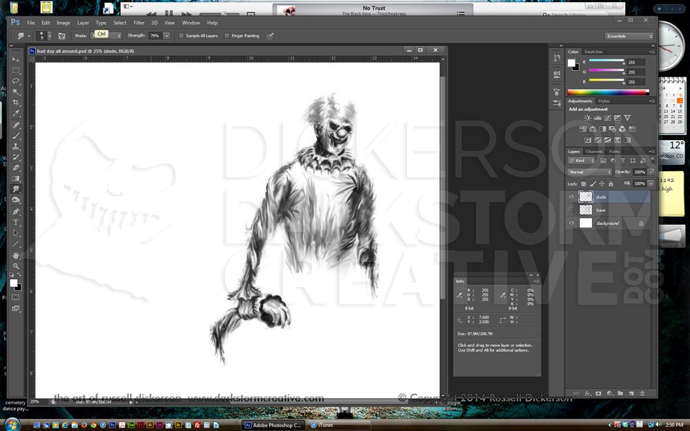
Instead, I chopped off his other arm, so that he could carry the appendage in his other hand. Which I thought was sufficiently creepy.
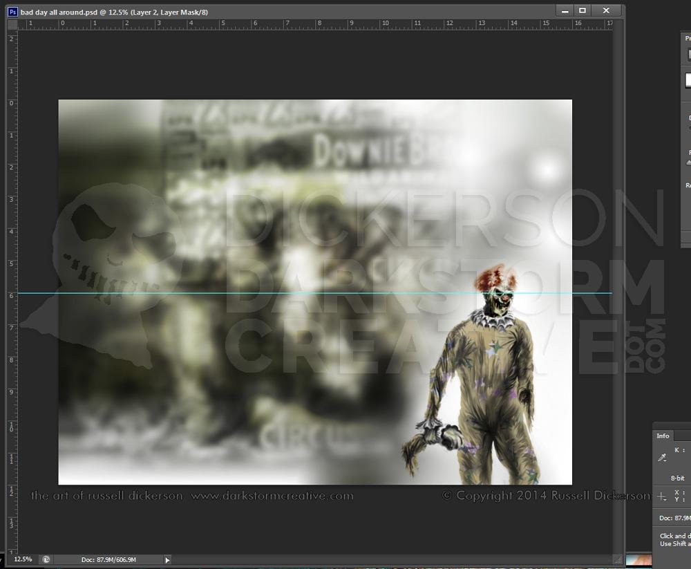
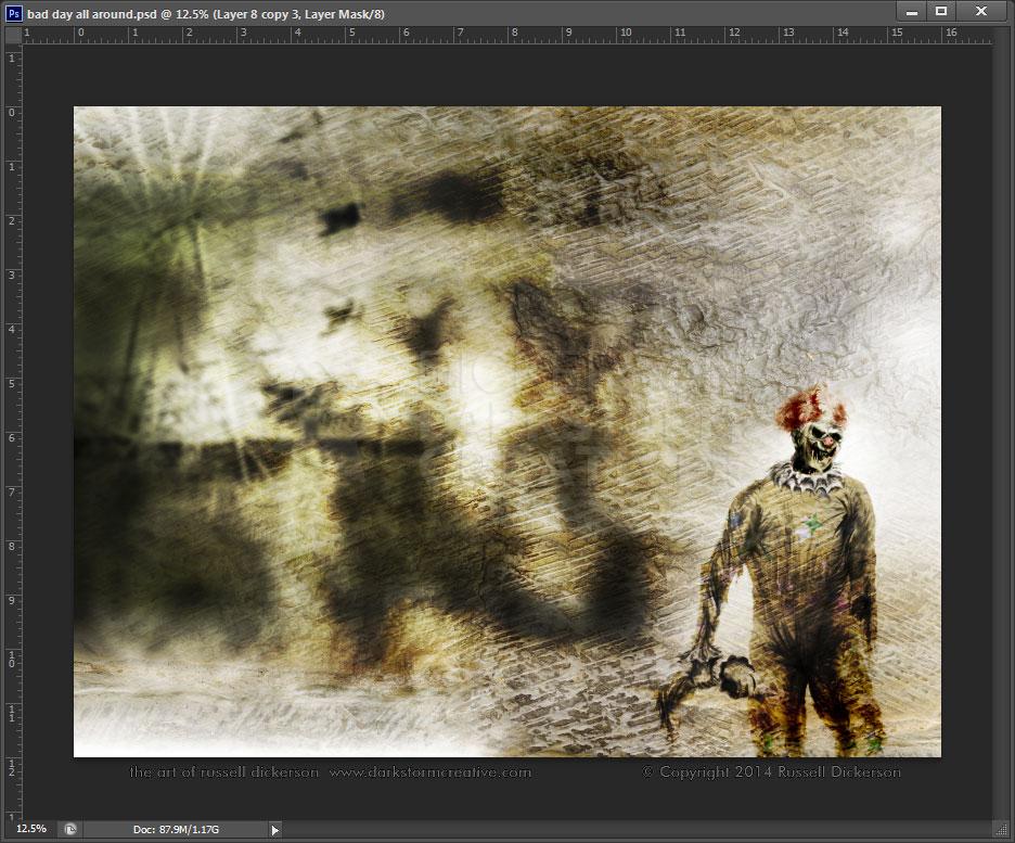
Now this really seemed to be going somewhere. I finished up the clown, adding some color and a “happy” suit texture of stars and such. I had been thinking of fully illustrating the entire thing, part by part, but I also had a more “loose” idea in mind as well. I thought that might be fun, so I started layering in images and textures behind the clown.
I found a handful of old circus photos in the national archives, and set about using them in interesting ways. I started with a circus cart, and blurred and retouched it until I had a nice background going.
It was a decent start, but I felt that the clown was a bit too detached from the rest of it. I thought it needed a lot more contrast too, and a sharper, “burned” look, so I added a few more photos for effect. I also used the Dodge and Burn tools to enhance areas of the background and of the clown.
I then added an overall texture to the piece. Even with the circus pieces in the background, he had still seemed detached, and I thought the texture over all of it would help combine things a bit more.
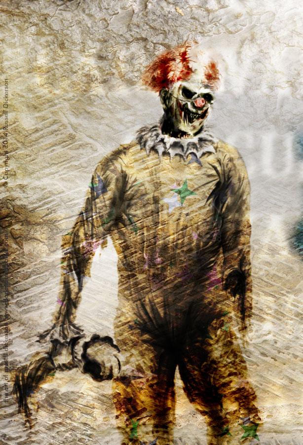
I thought that worked out well, and I decided to work with some text over the top of it. While I was working with that, I decided to touch up the clown’s color a little more, and to work with the contrast a bit. I also wanted to lose a little of the texture around his head, so that it was clearer. The texture was great, but it covered up his head a little much.
Here’s the closeup of that.
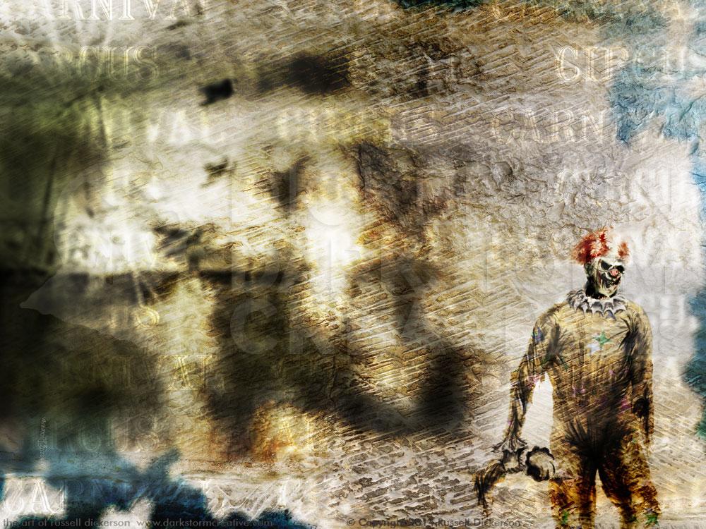
I worked with the text as a series of smart objects, with masks, blurring, and blending modes, to get the right representation of the text. It needed to be there, but it also needed to clearly be a part of the piece. I also added a blue texture in parts, which gave the overall piece a different, more grounded feel.
Here’s the final piece, I call it Bad Day All Around. Let me know what you think of it.
