Sometimes when I start a new personal piece of art, I don’t necessarily have a direction in mind. I might have a general idea, or a smidgen of something in my head. In many cases, such as last week’s ink (see that here), I know exactly what I want out of it.
With this new ink, I was thinking of doing something with stone, or at least the texture of stone. I looked at a lot of reference material that I have for ancient architecture and sculpture, but nothing really stuck.
I happened across a skull motif from the ruins of Palenque, and started sketching it out. At that point, it was with the idea of recreating the image as I saw it. But it didn’t stick, and I couldn’t quite get into the idea. I went upstairs, grabbed some iced tea (and cookies that I didn’t actually need), and came back to it.
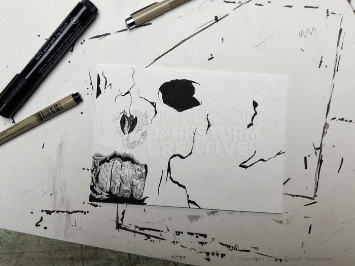
Despite at least the beginnings of the art on the page, I decided to stop where it was, abandon the idea of Palenque, and make it whatever came out. Here’s what it looked like starting out, with the teeth of the original inked in, and pencil lines for a different idea.
Click on it, and all images, for a larger version.
At this point, I considered tossing the whole thing and going to watch something on Netflix. It probably would have been something really awful.
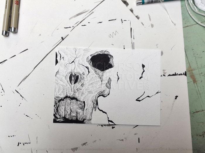
But I kept at it, and started inking and penciling in a lot of other areas. After just a little bit, I realized that I really did have something worthwhile going, and kept going.
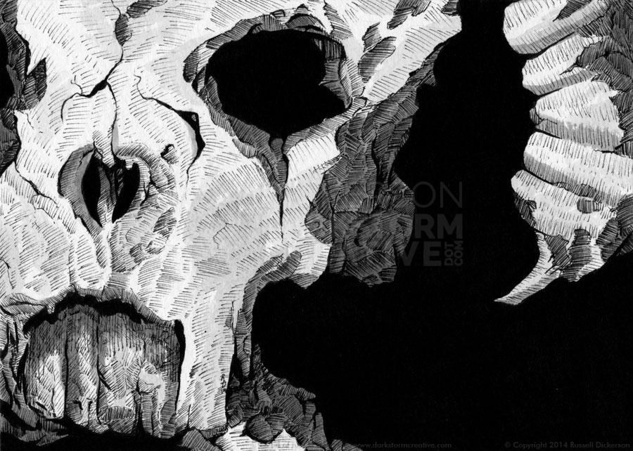
I really wanted to keep the stone idea, so I created textured areas of broken stone. I also used lighter lines to create a smooth, but still textured, stone surface. The idea was to give the impression of sculpted lines, softer than the rough stone of the broken areas.
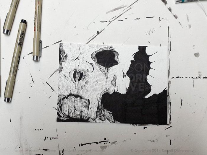
I could now clearly see where it was heading, so, after crosshatching in a few more spots, I filled in the background’s first black layer. When I did that, the full idea really came to life. It’s moments like those that I live for as an artist.
The initial skeletal teeth that I had started with no longer really worked as human, if stylized, teeth. They now took on a much more sinister, almost animal or mask-like idea, so I went with it. I darkened more of the areas in and around the teeth.
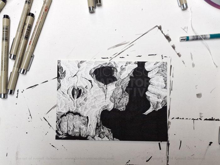
I kept crosshatching all of the various areas, trying to balance the lighter, smoother stone with the rough, broken areas. I also went back to other parts to darken them, hoping to bring some shadowing in. Here’s the image, fully crosshatched.
I considered stopping right there, as I liked it. But it bugged me a bit that it came across as texture only, and not any real depth because of that. So I decided to add some ink wash to it.
I first started with about a 30% ink in water solution, to darken the areas up quite a bit. That worked very well, but it occurred to me that the white areas would still have some shadowing as well. I made a 10% solution of ink in water, and added some very light shadows in the white areas to add depth carefully.
Artist’s note: in no way did I measure 30% or 10%. My method is what you’d call “squeeze a few drops of ink into the palette and see what happens after I paint it on a scratch piece of stock”.
After it dried for a bit, I used calligraphy ink on the black areas to make them far more solid (see that effect here in the last ink). Here’s the final piece, 5″ x 7″ on 140 lb. Cold Press watercolor stock.
Let me know what you think. I call it, Waiting for a turn. Which, if you think about it, is kind of creepy.
1 Comment
Digital Art: Bad Day All Around » Darkstorm Creative: The Works of Russell Dickerson · April 22, 2014 at 9:44 am
[…] Ink Art: Waiting for a turn […]
Comments are closed.