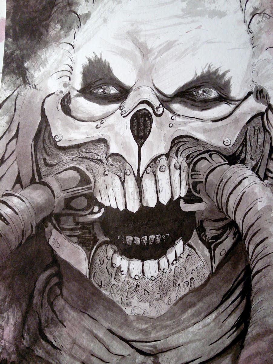
I’ve come to really love painting the traditional way, though I still love digital art as well. But traditional art, such as inks and acrylics, give me a different sense compared to digital. It’s not just that I see my art differently from medium to medium, it’s that my whole approach is different.
In many ways, it’s less secure. With inks, that’s not as much an issue, I’ve done quite a lot of inking over the years, and I’m much more comfortable with it now. I know how to plan for things, where the lines should go, and how they act when they are combined.
With painting, especially the acrylics that I do, I don’t have that security yet. I think that working with inks, being line after line (sometimes tediously), is just a different feeling altogether. When I get to acrylics, I start working with color, and layering, and many of the other things that I do digitally.
It’s not just the idea that there’s no “undo” button, though there is something to be said for that old adage. It’s just that, as I work with color, my mind changes constantly because of the effects that are being created on the canvas. With ink, that’s not really possible. If that plan is faulty, it’s going to come out like crap.
With digital art, I change my mind all the time. Which isn’t a problem, in fact that experimentation is why I love working digitally. But I still have the same ideas when I sit down to paint something with acrylics, and it actually makes things a little tougher.
I can’t just experiment on a new layer, as with Photoshop. There’s no way to save another version, just in case this one doesn’t work out. When I try an experiment with acrylics, it’s all or nothing.
Case in point, my new acrylic painting.
It started out with a completely different idea than what it ended up to be. Partially, that’s due to a simple changing of the mind. But a lot of it has to do with the development of the piece as I was painting it, changing the original idea into something else.
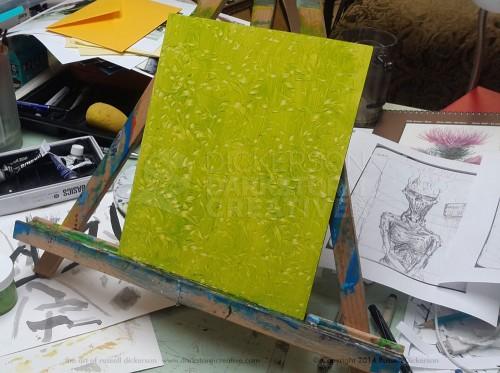
Here’s where we start, with a green background. I am using a gessoed board, 8″ x 10″, which is quite smooth. Since it’s smooth, without the canvas to grab the paint as it goes by, getting a smoother shading is more difficult. Which is fine with me, I like the textures it creates. Click on it (and all of them) for a larger view.
You can see the original idea, based on a creepy sketch, to the right of the panel. The “leaves” effect was created by taking the metal lid of an old airbrush bottle I have, pressing it into the wet paint, then giving it a twist. Over and over again, until the texture looked nice.
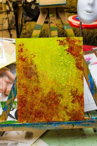
Even at this point, the idea of painting the creature in the sketch was losing ground. I went ahead with things though, after the green dried I added a mixture of crimson and brown to the painting. To do that, I took a fan brush, dipped it in the color, and twirled it in my hand as it touched the green panel. It gave a nice, rounded effect, more interesting than just a brushing of the red tones onto the panel.
Here is where the idea ran off the tracks. I looked at the creepy sketch, and realized that it would no longer work with this kind of painting. But I also liked how it was looking, so I didn’t just want to abandon it. My mind started fighting over the idea of the creepy sketch versus the profile of a woman. She would be painted in the center green area.
As much as I liked both ideas, and the painting as it was, none of those were going to work together. My brain went into a bunch of mush, so I did what any other enterprising creative would do.
I left it there on the desk, and wrote 2,000 words on an unrelated novella instead. Then I wrote about this beautiful Russian painting.
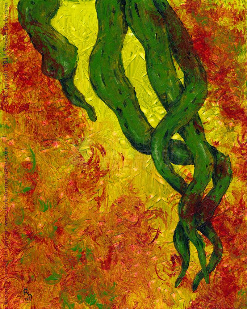
Sometimes, you just have to back off until the right idea is set into place. As it was, an idea that had been floating in my head for some time came along, and I realized that it fit better than anything else. In fact, it was the right thing to paint, at the right time, and I went for it.
Here is the final painting, the result of calming my brain down a bit, and getting away from it for a little while. It is 8″ x 10″, acrylic on gessoed wooden panel, let me know what you think. I call it, The Fight Was Lost.
