As an artist, what resonates with me is the idea of creating something that hits a little deeper than simply showing a scene. Sure, as an illustrator especially, there are plenty of times where I need to paint the scene as it is. Much of the time, illustrations are visual adaptations of a story, and need to reflect that.
That’s not to say that any one technique, or specificity versus vagueness, needs to be demanded. That should be up to the artist, and their particular style. As long as it represents the story, the illustration can work in whatever way it is designed for.
With genre art that doesn’t need such exacting measures, such as a general book cover or even simply genre artwork, the artist is free to create as they will. There’s no story to represent, and it’s closer to fine art in that you can create whatever image you want. Which means there are no real rules, and that freedom is great.
Often with this types of pieces, I will choose subtlety over the overt horror that many other creators use. In the case of horror art, I think that’s where there is a definite line between those pieces that are simply meant to shock, and those that are designed to get inside your soul.
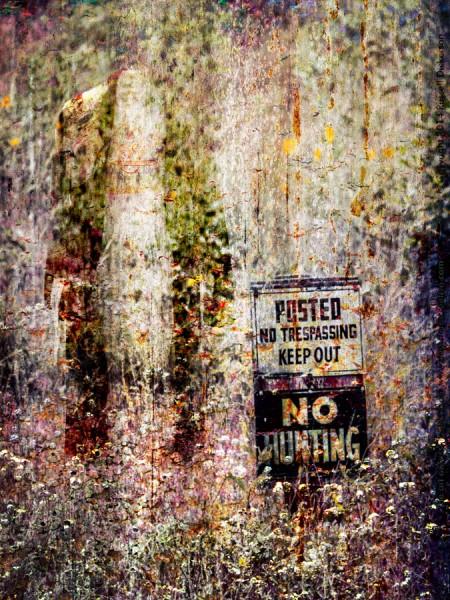
For example, in working with my newest art piece, which you’ll see below, there are several approaches. The image started with a “no trespassing” sort of sign, and I wanted something horrific behind it. “Horrific” is a word that is wide open to interpretation. That could be something very overt, like blood and gore everywhere. It could also be very subtle, like a small, barely visible skull.
To be fair, I’ve certainly created both styles of art. I have plenty of gory pieces, though my more subtle pieces far outweigh them. In the image below, the idea of a headless person went through my head as I was working on it. My ideas ran from the very subtle to the very grotesque, and in the end the subtlety won the day.
Here is my newest art piece, digital art known as And No One Cares.


